The Conversation (0)
Sign Up
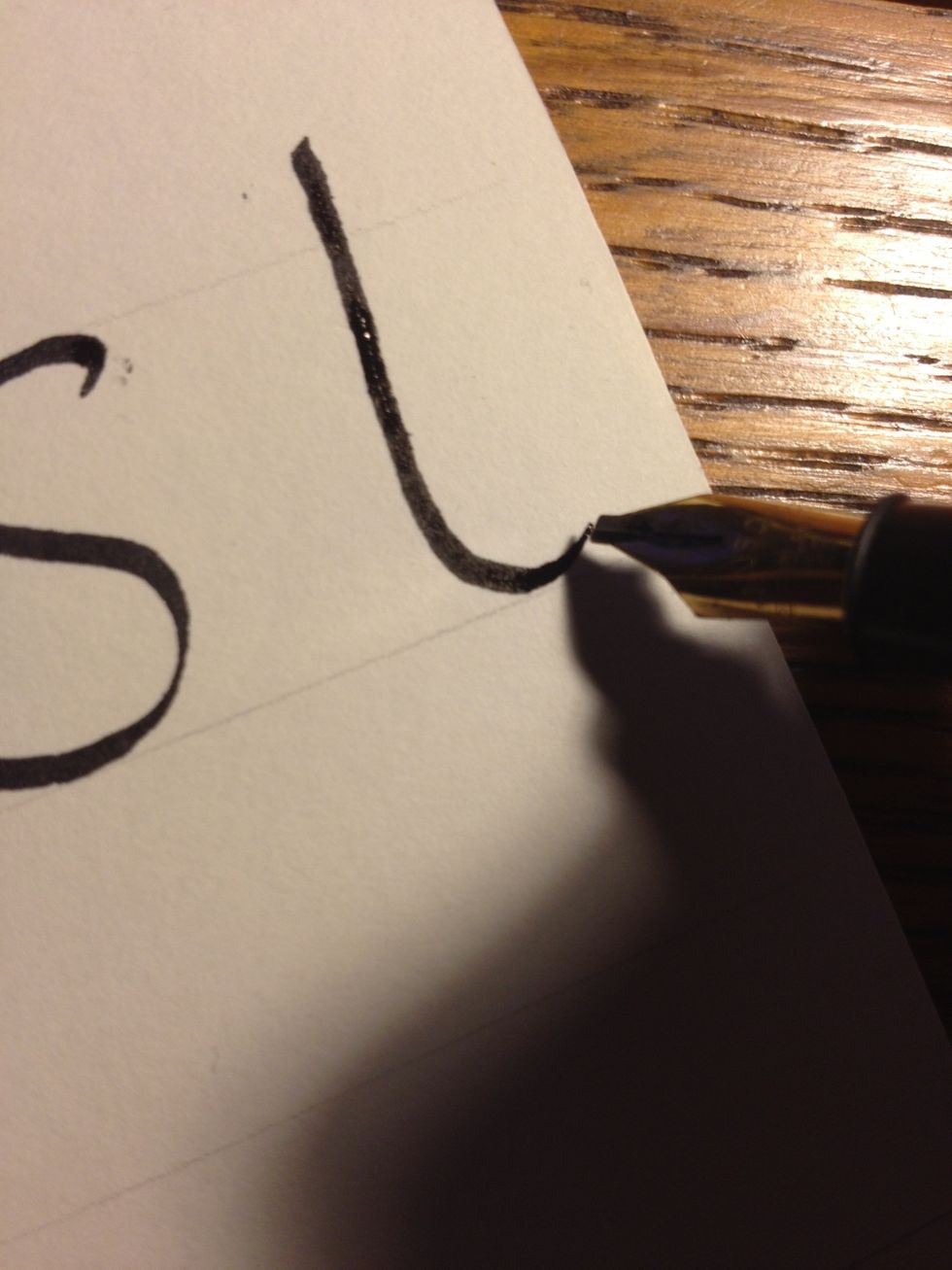
My apologies, I forgot to upload written instructions! Anyway, start "s" at the top line, nib angled at 45 degrees as usual.

Make an upward tic, an "s" motion, and another tic at the bottom. Note where the stroke thins and thickens; if yours isn't the same, adjust your nib angle.
Start "t" by making a tall trunk, without a top tic, ending in a reverse "j" shape.

The second stroke is a thin, straight line from the top of the trunk to the top line.

From there, cross your "t" with a thick, straight line. There should now be a small triangle formed by the three strokes.
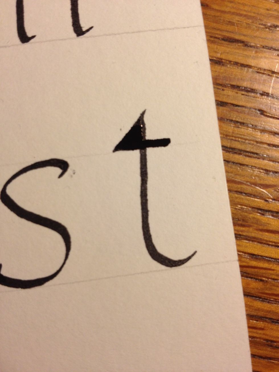
Fill in this triangle to complete the letter.
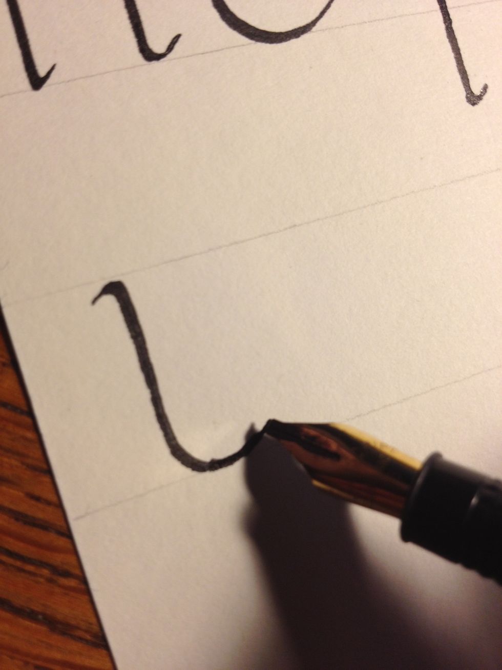
Start "u" with a standard trunk with a flare at the top, going into an exaggerated reverse "j" shape.
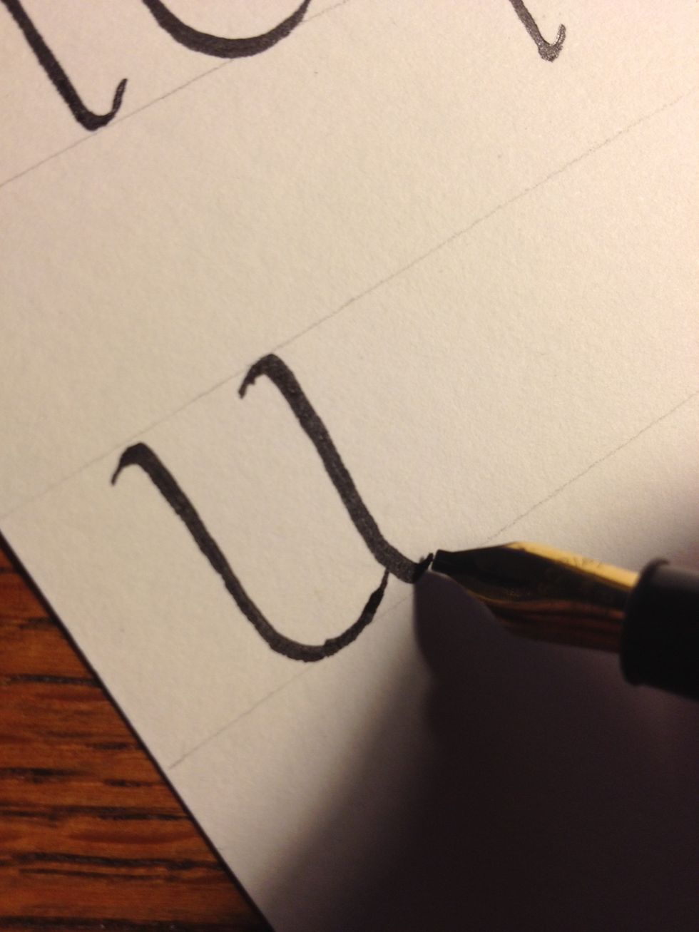
The second stroke is a trunk like the first, but with flares at both top and bottom. Make sure it touches the end of the first stroke.

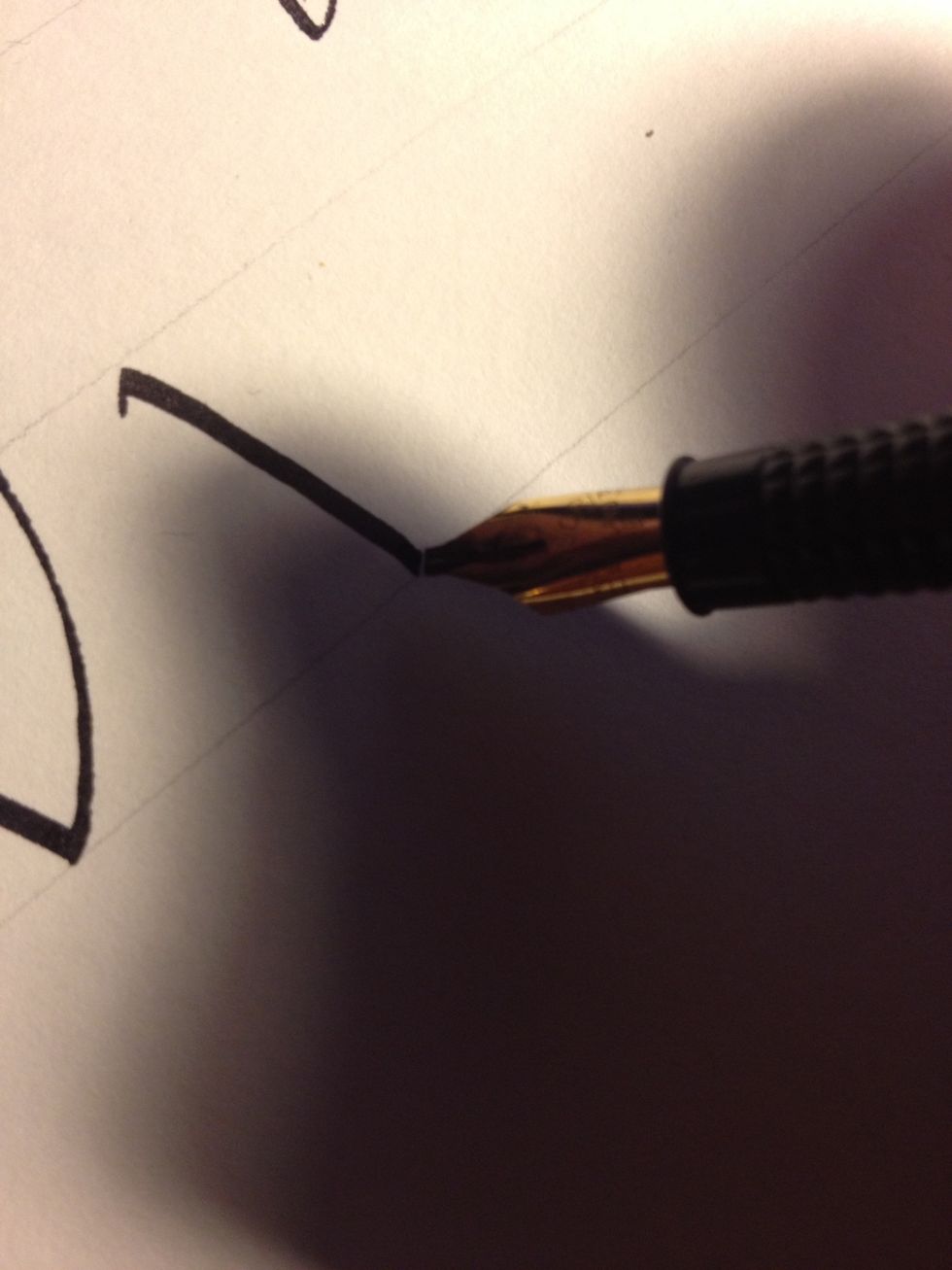
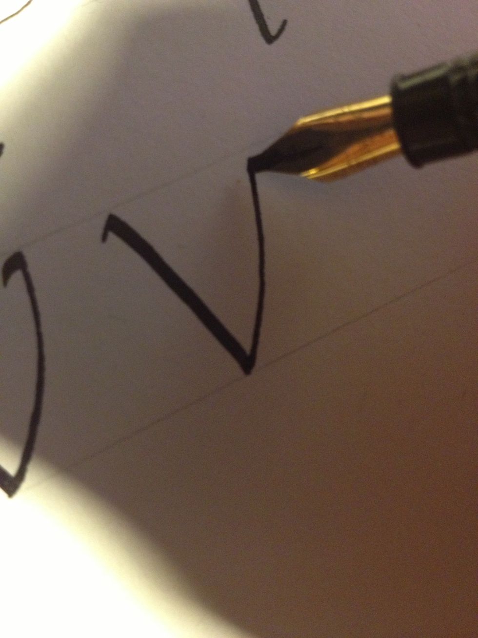
Letter "v" begins by making a thick diagonal line from top line to bottom, with a tic at the top.
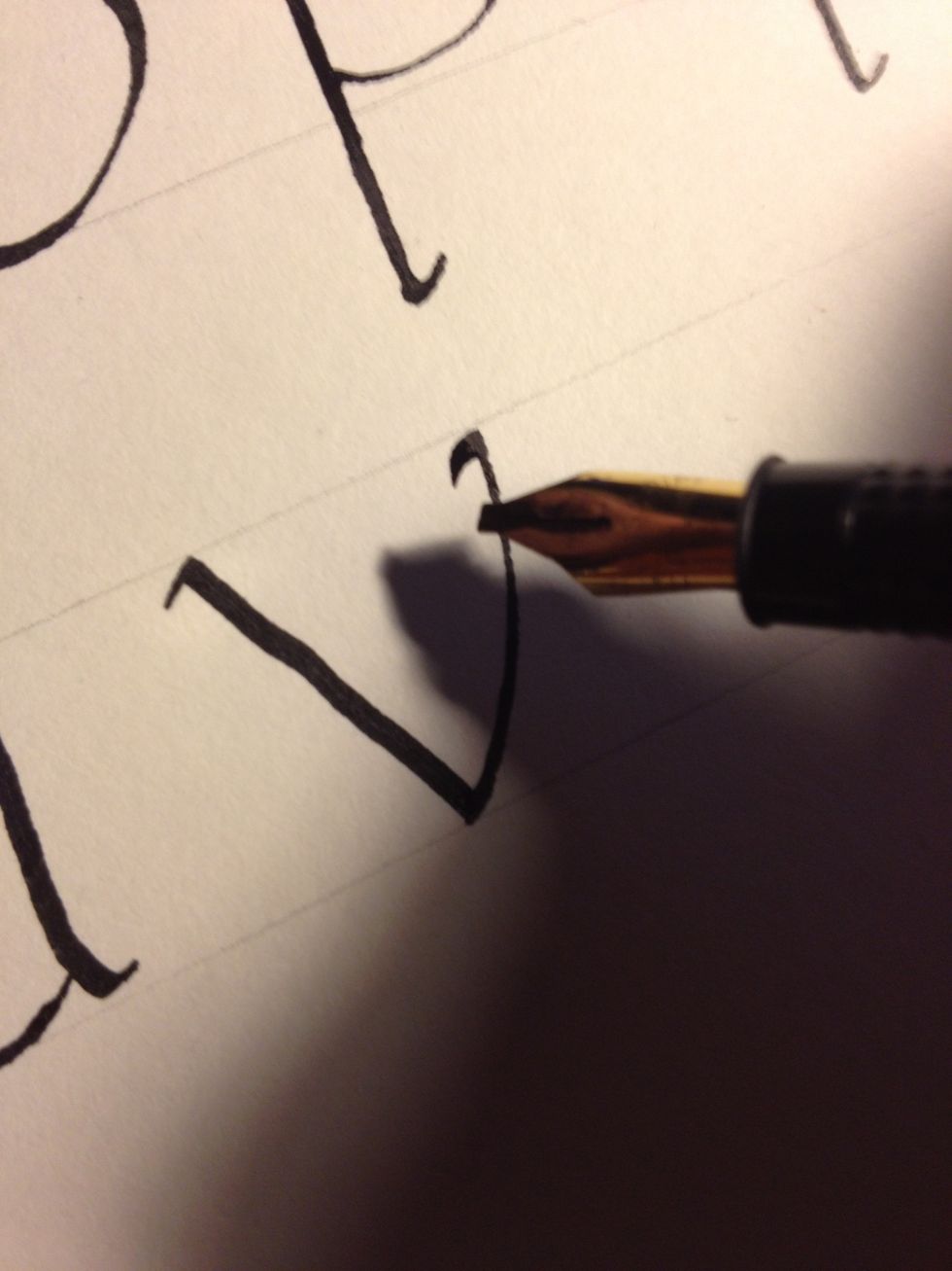
Maintaining nib angle, make a second thin line back to the top line. Curve it slightly upwards, and add a tic at the end.
Letter "w" begins the same way as "v"...
...and continues in the same fashion...
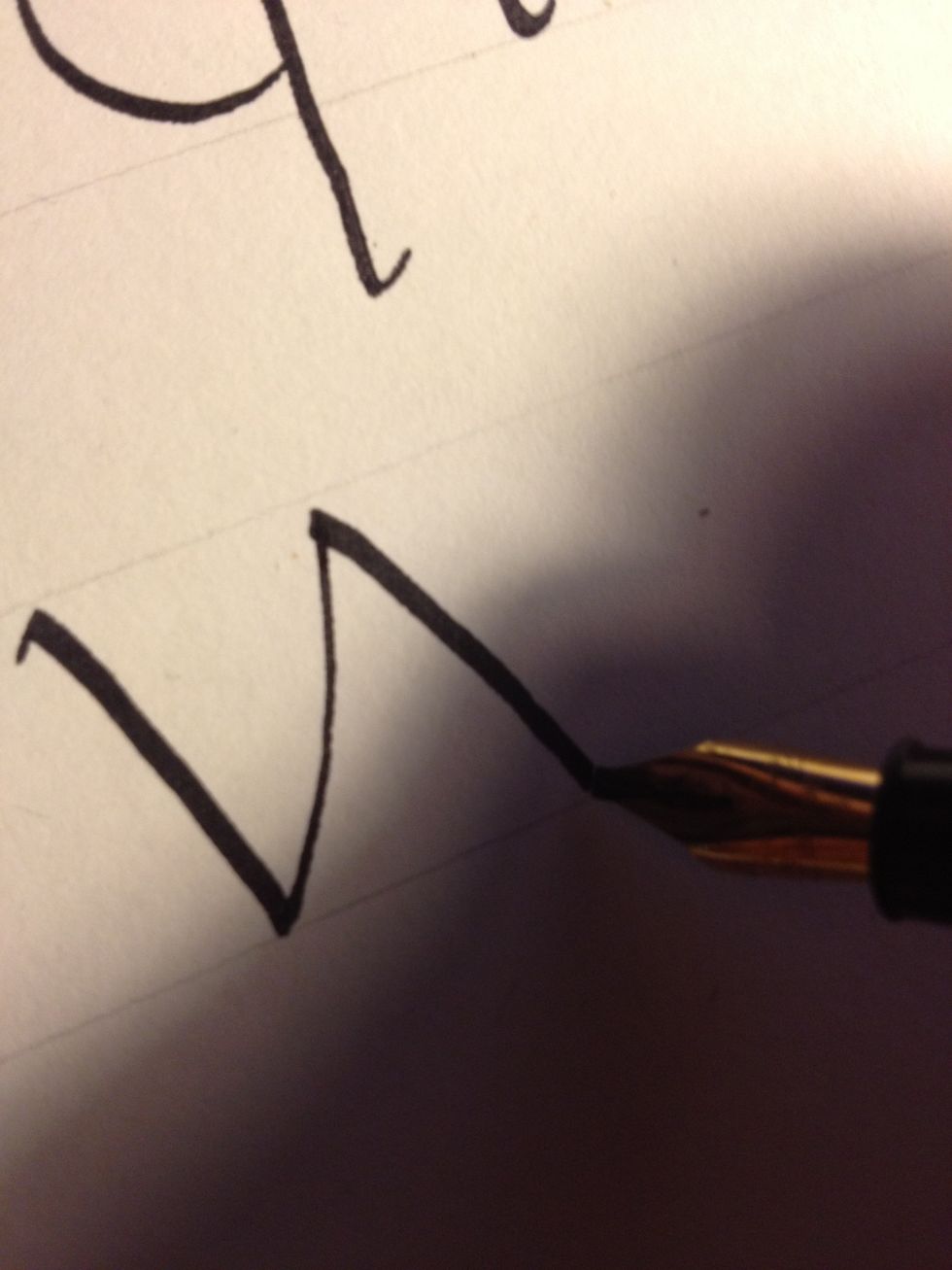
...only to repeat itself...

...for two more strokes.

Letter "x" starts it's life as a thick diagonal line with tics at top and bottom.
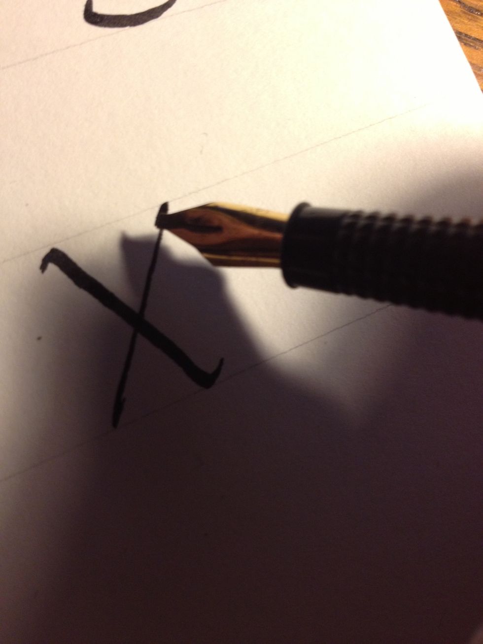
The second stroke is a thin line, with tics that curve back on the line rather than flaring out. They should look like they are hugging the stroke.
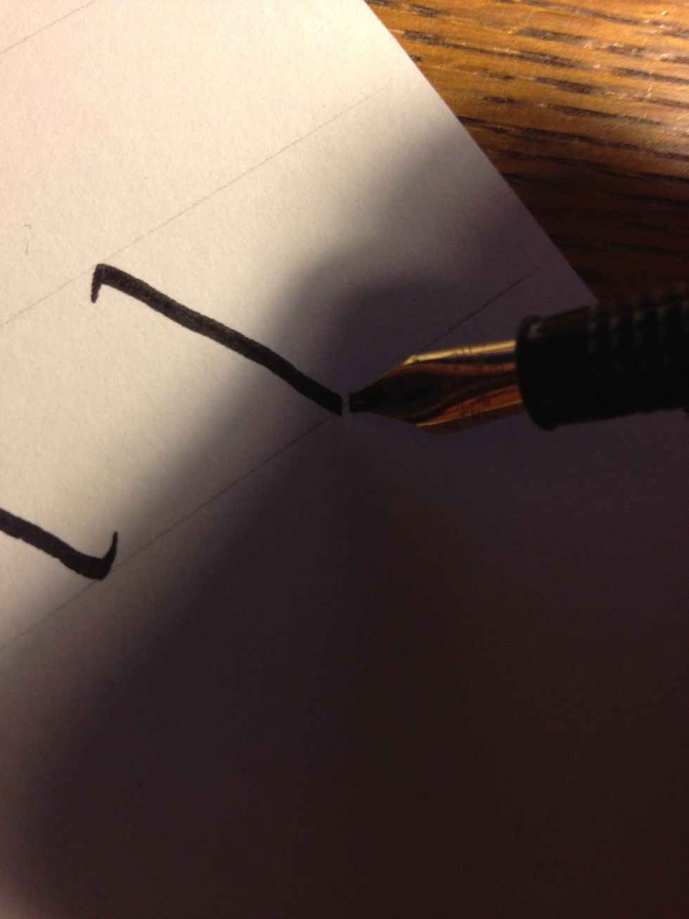
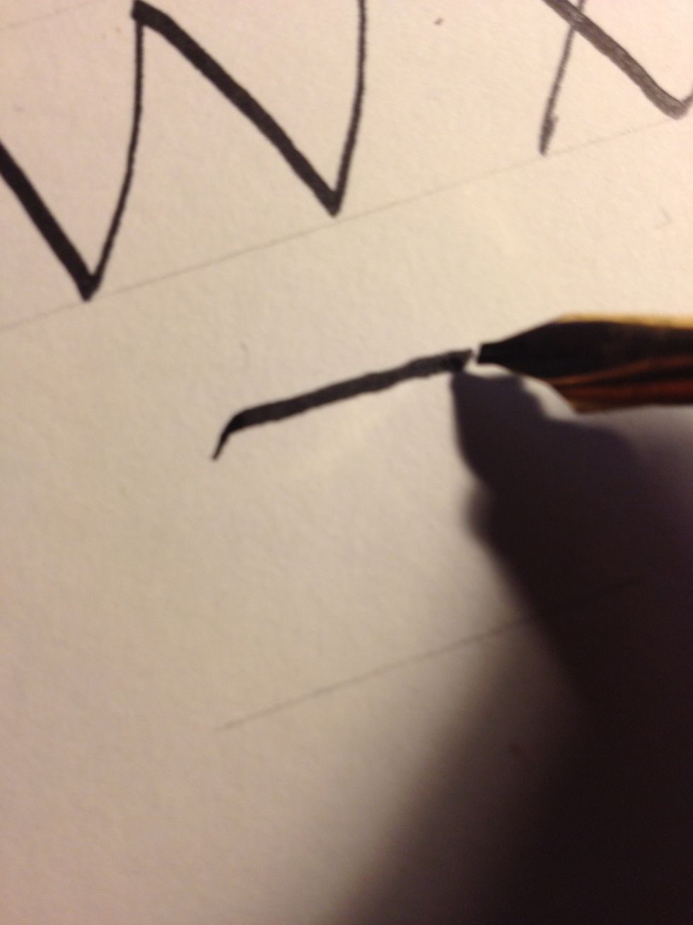
Letter "y" also begins with a diagonal, but with no tic at the bottom.
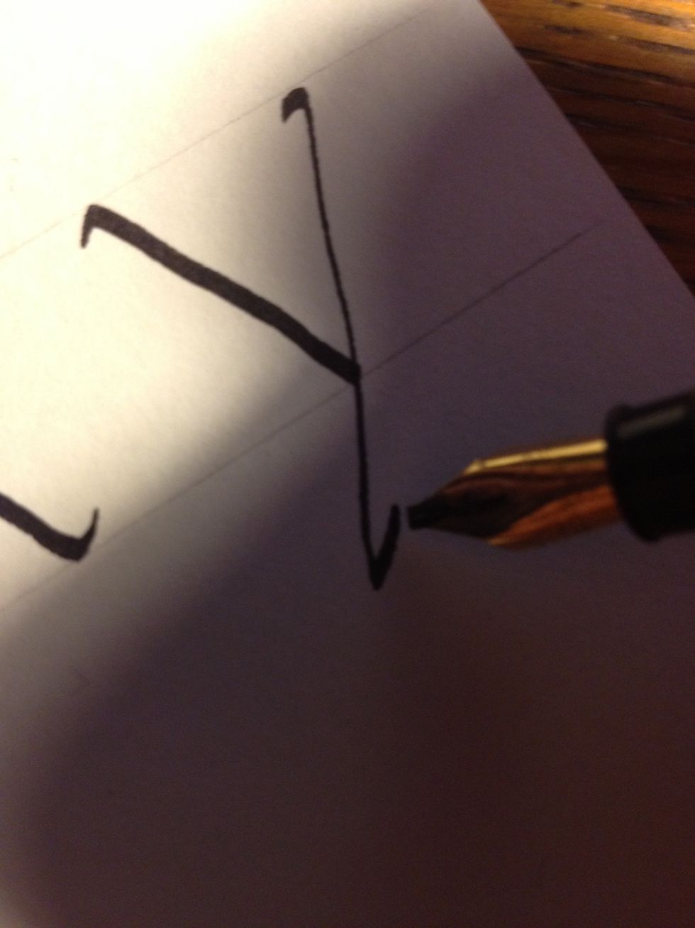
The second stroke has a tic at the top and goes well below the bottom line. The tic curves back on the line and is greatly enlarged.
Letter "z" begins with a straight line along the top line, slightly curved at the beginning.
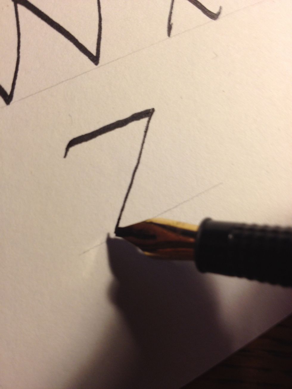
Go right into the second stroke, a thin straight diagonal.
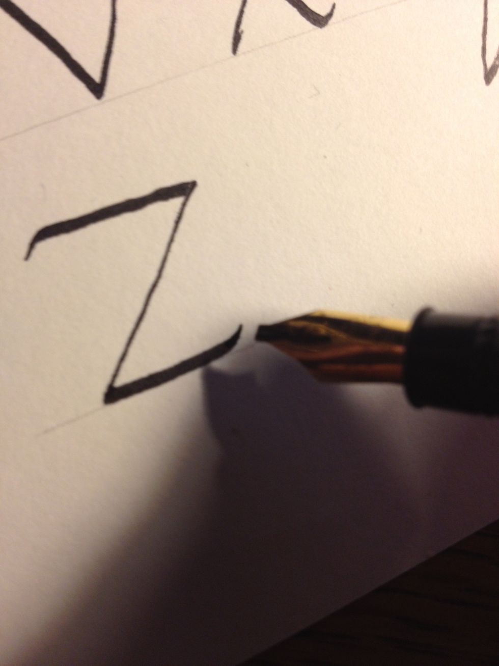
Finish the letter with a straight line along the bottom, curving up a little at the end.
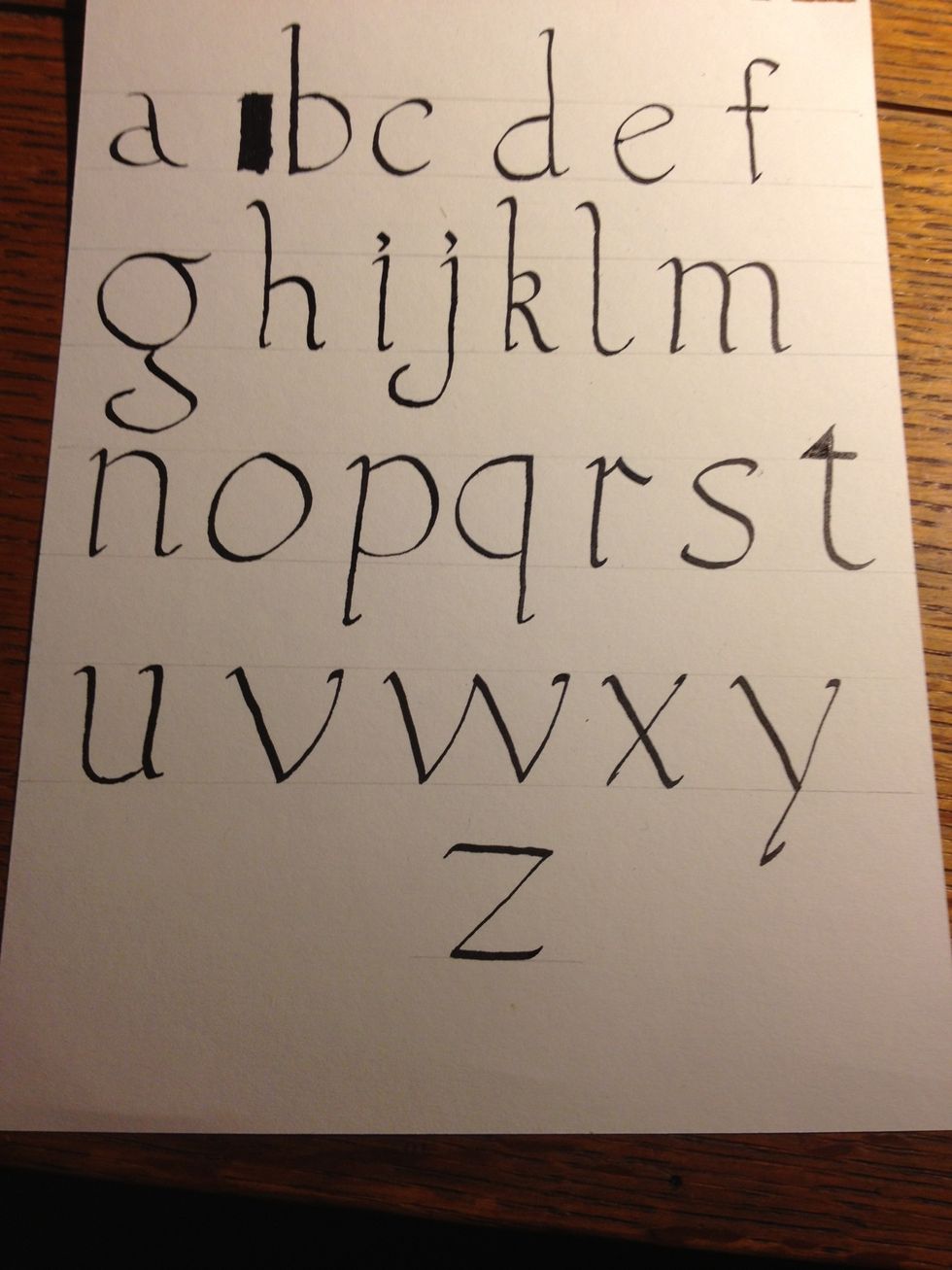
Congratulations; you have completed your first alphabet! Next up: foundational Majuscules, or capitals, and then onto the beast itself: Gothic calligraphy!
Tip: experiment with font sizes! I wrote in a very large font so details could be seen more clearly; try smaller fonts for thicker, more solid-looking letters.