The Conversation (0)
Sign Up
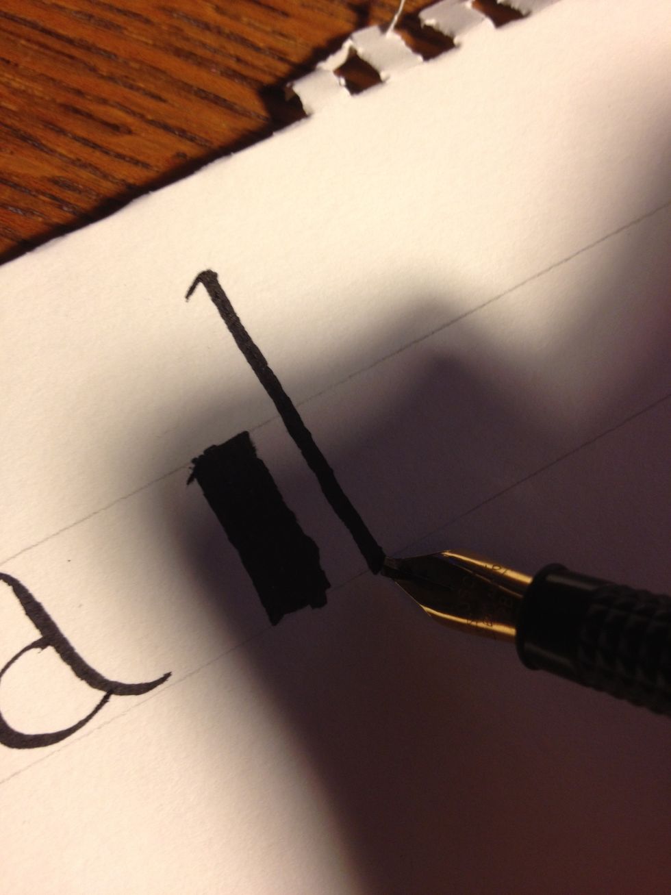
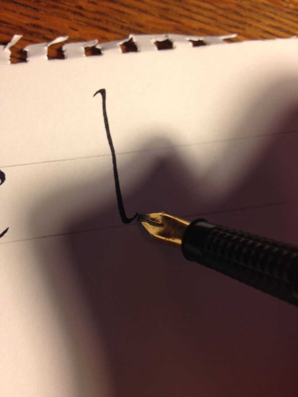
A basic minuscule "b"; ignore the block to the left of it, it's a "b" I wrote in the wrong size. Start well above the top line, with the nib angled 45 degrees down to the left. Make a trunk as shown.
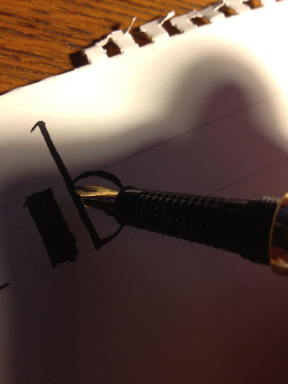
From the bottom, go right into the second part: draw a half-circle, maintaining nib angle, up to about a third to halfway up the trunk. I made mine a little exaggerated for demonstration purposes.
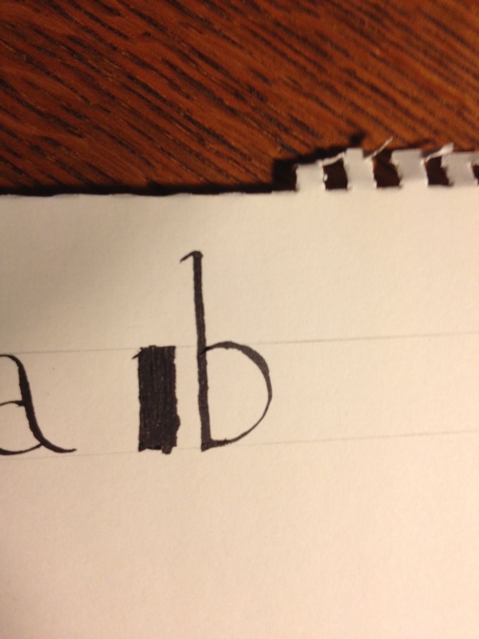
Not my best work, but you get the idea. Letter "b", and it was easy!
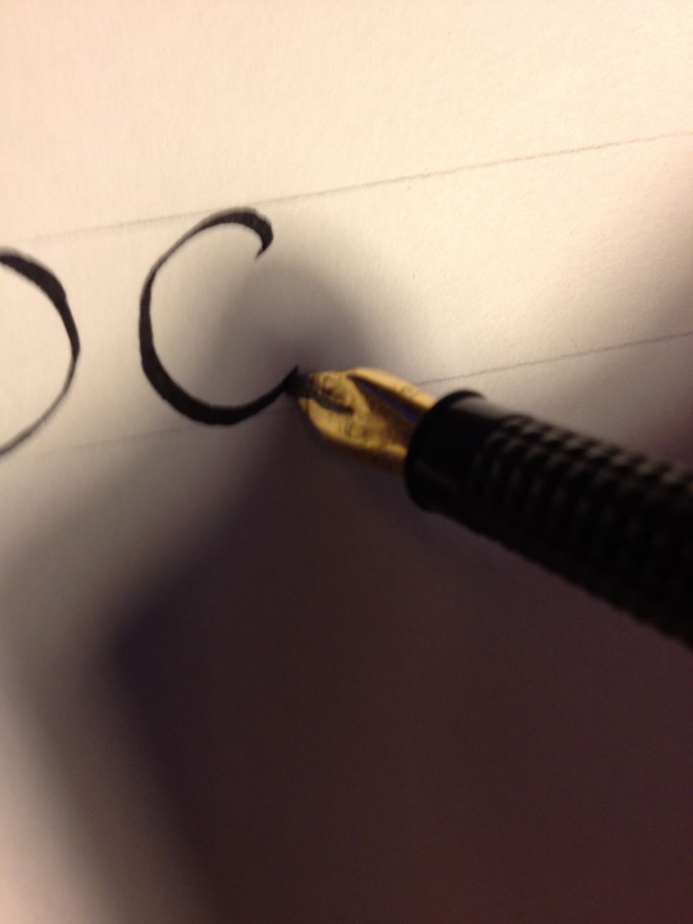
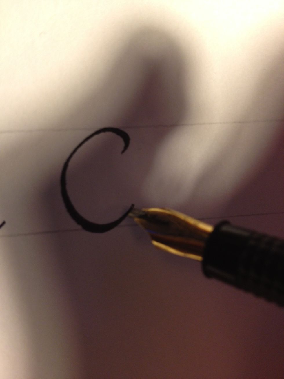
The letter "c is even simpler: maintaining that 45 degree angle, make a small upward tic, then make a semicircle.
For "d", start out making the same stroke you would make to start "b", then make an upward tic at the bottom.
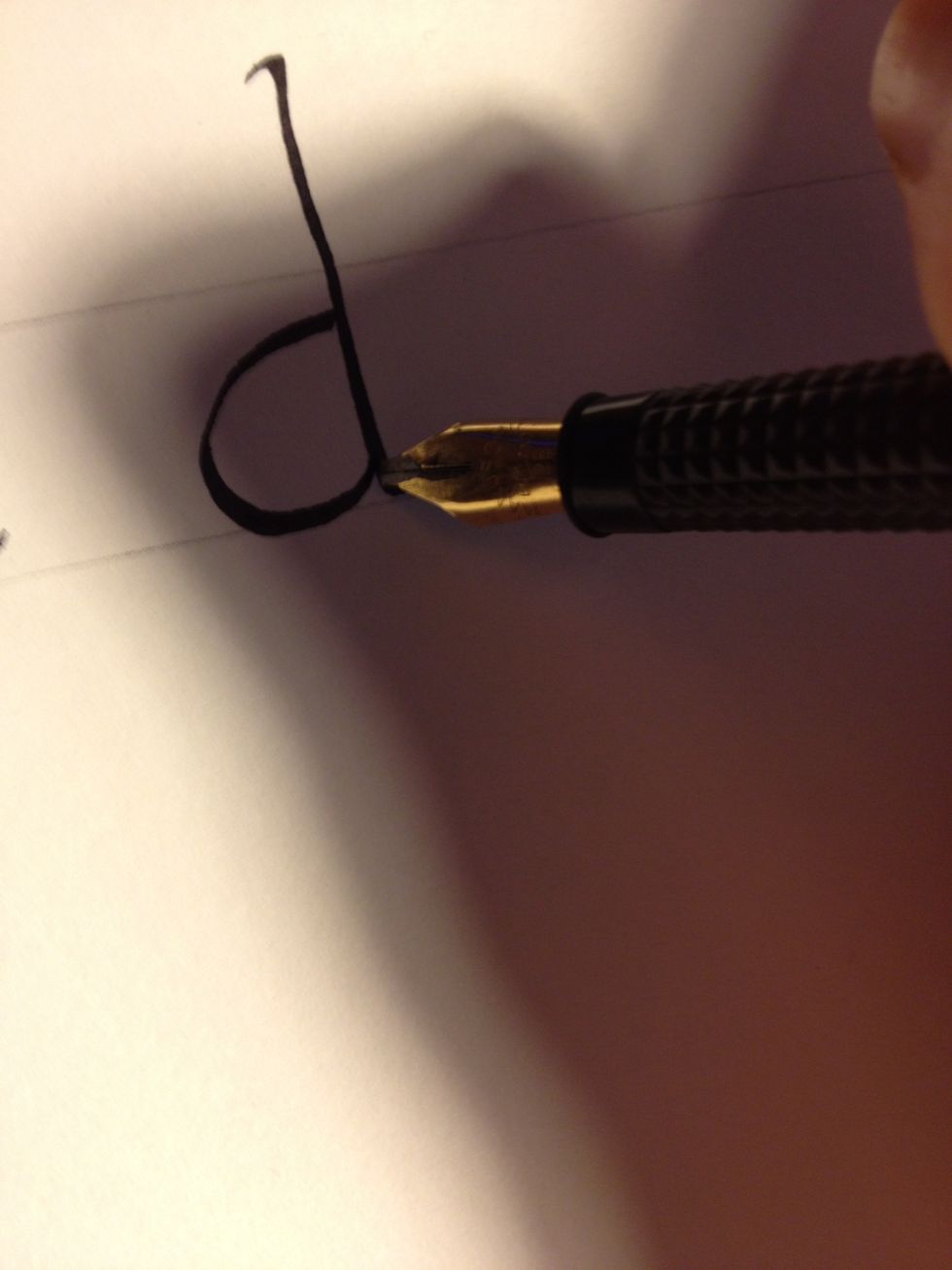
Keeping the same angle as the first stroke, start the second stroke at roughly the same height as you would for "b", then make a letter "c".
For "e", start out by making a letter "c".
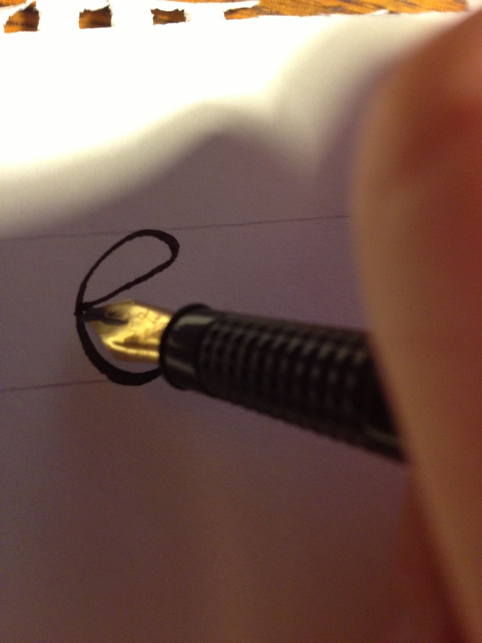
Then, starting at the tic at the top of the "c", make a slightly curved line with the thin edge of your nib traveling about 45 degrees downward until it curves up just before meeting the first stroke.
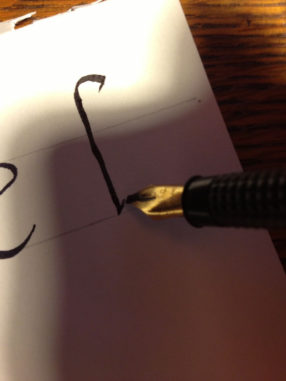
For "f", make a tic well above the top line, then draw a cane with another tic at the bottom.
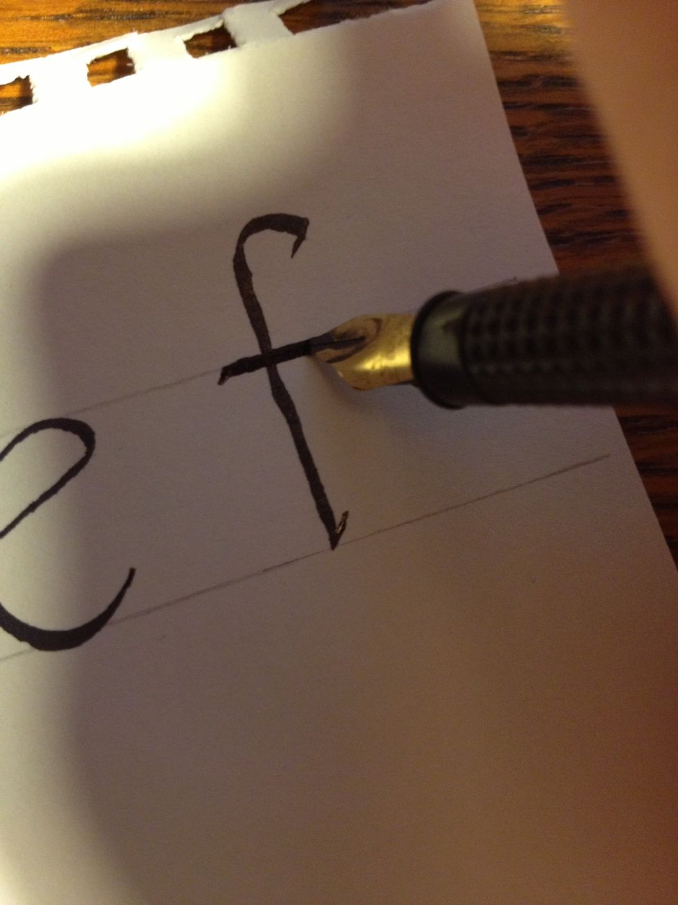
Make the second stroke along the top line; it is simply a straight line with the nib at 45 degrees.
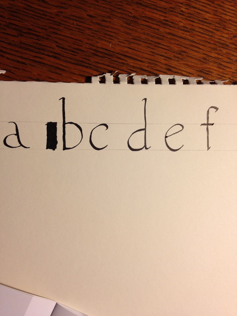
Congratulations; you now know six letters in minuscule! The font I am using is called Foundational, so called because it is considered the most basic calligraphic font. Ain't it perdy?
Tip: Keep proportion! If you make a letter one size in one place and a bigger or smaller size in another, your manuscripts will look sloppy. Practice strokes that you have difficulty repeating.