The Conversation (0)
Sign Up
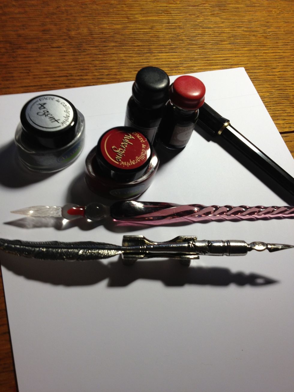
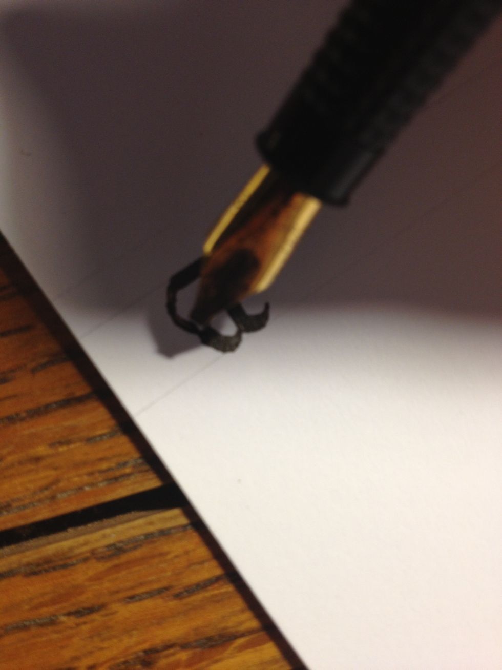
Right, well, at long last, I'm ready to dive into perhaps the most famous calligraphic font: Gothic! We'll start with the Minuscules; make sure you have a quiet place to work and plenty of time!
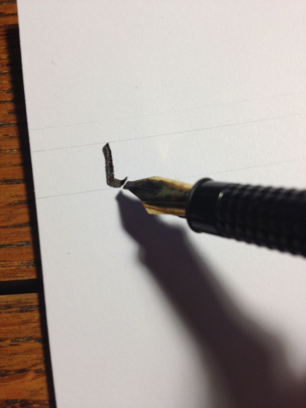
Letter "a" starts life as a basic trunk that curves to the right just before reaching bottom.
Make a thin downwards diagonal line from about halfway up the trunk.
Then make a curve into the bottom of the trunk. It should begin thick and end thin.
Finish it off by drawing a thick stroke from the top of the trunk across the top line, then making a thin curve into the second stroke. A bit of pen manipulation is needed to keep the curve thin.
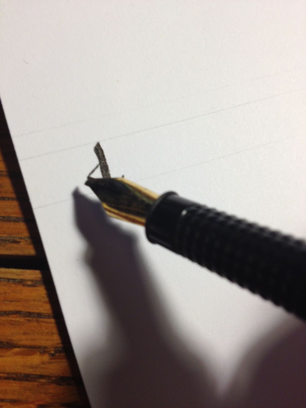
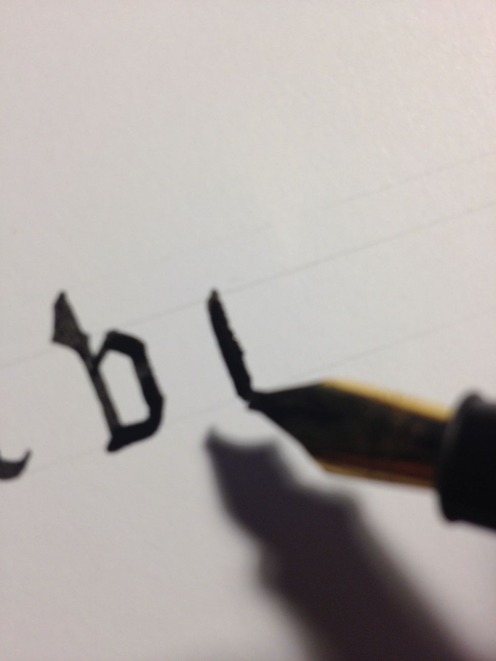
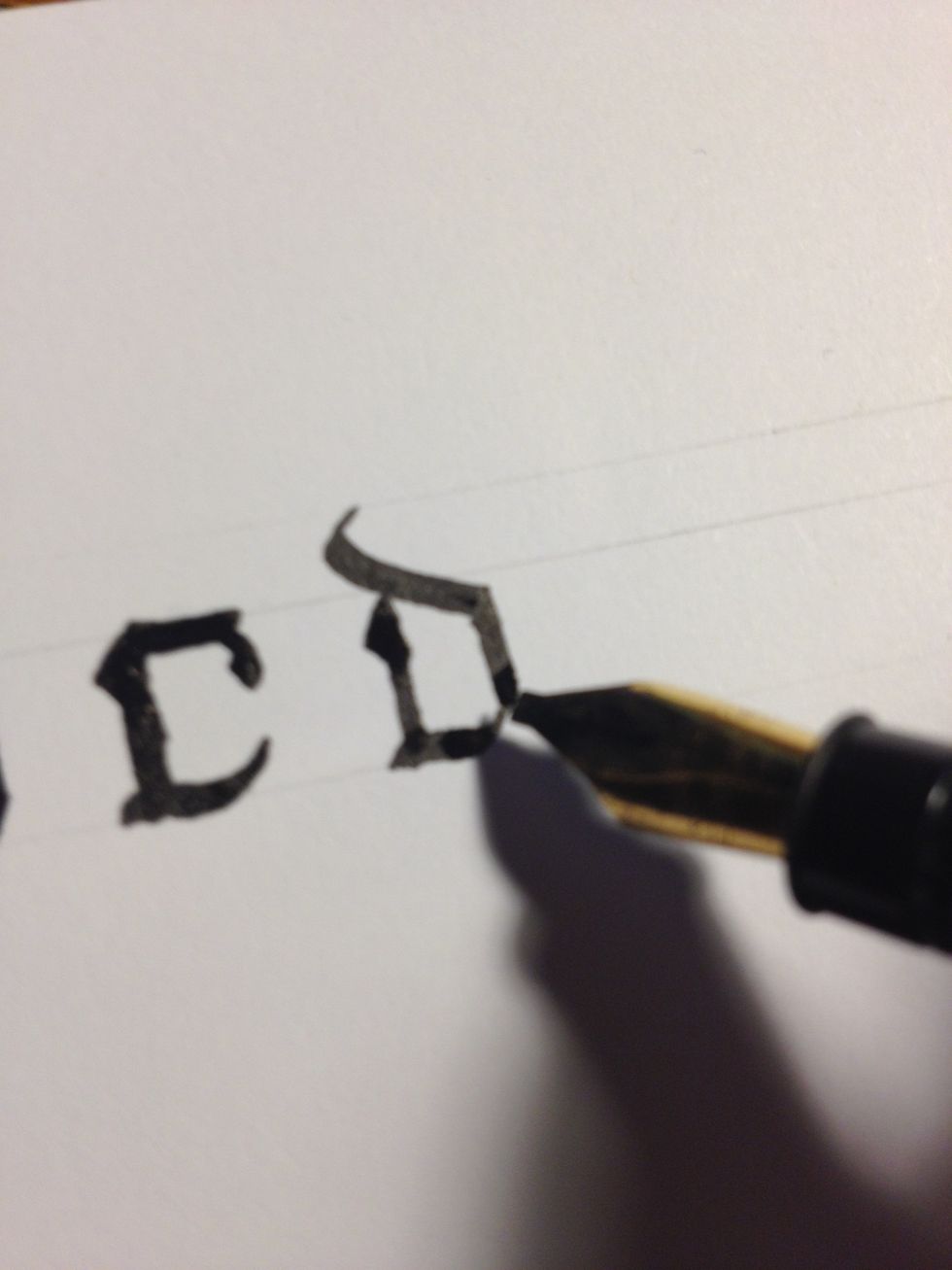
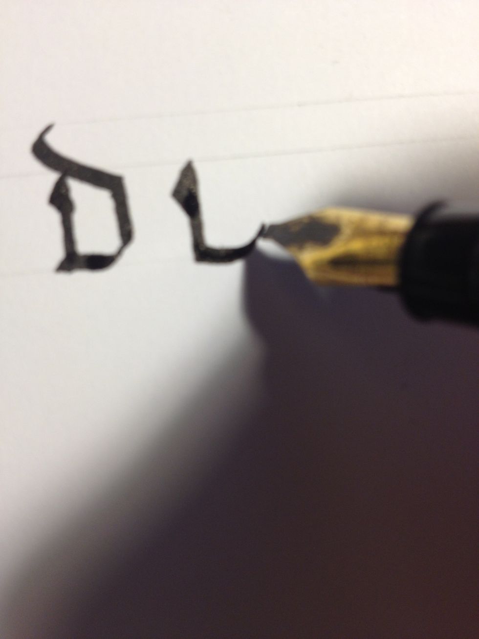
Make a tall trunk with a triangle embellishment at the top to start "b".
Make a thin diagonal line about halfway up the trunk, but below the top line. Make it continue to the top line, then make a thick downward curve.
Finish it off with a second trunk and a straight line across the bottom line.
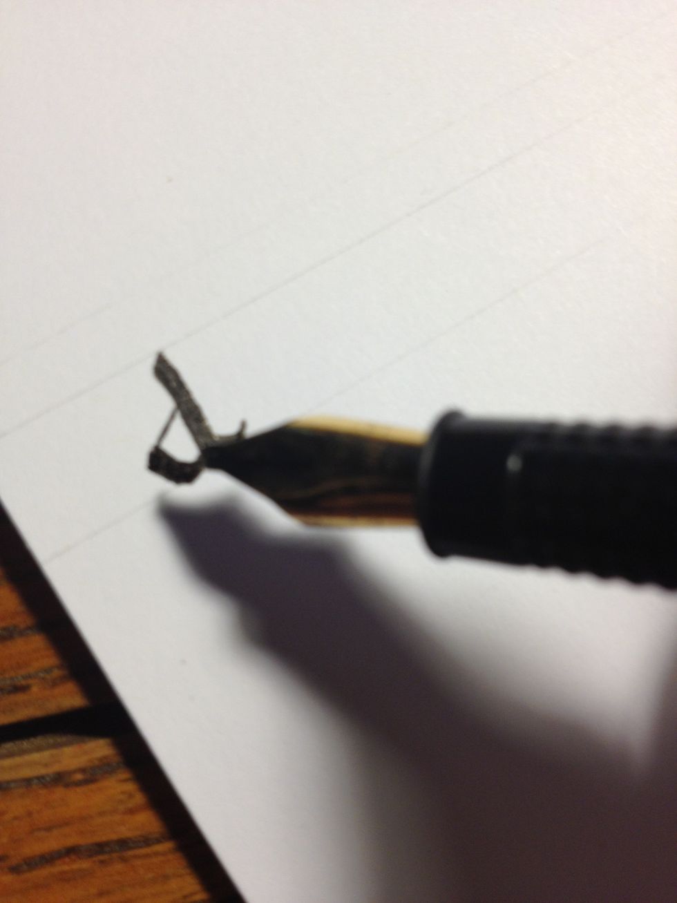
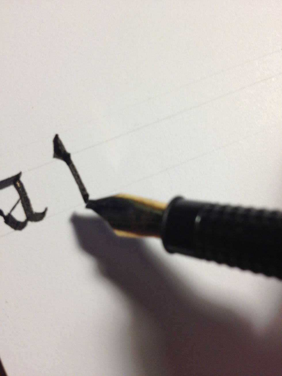
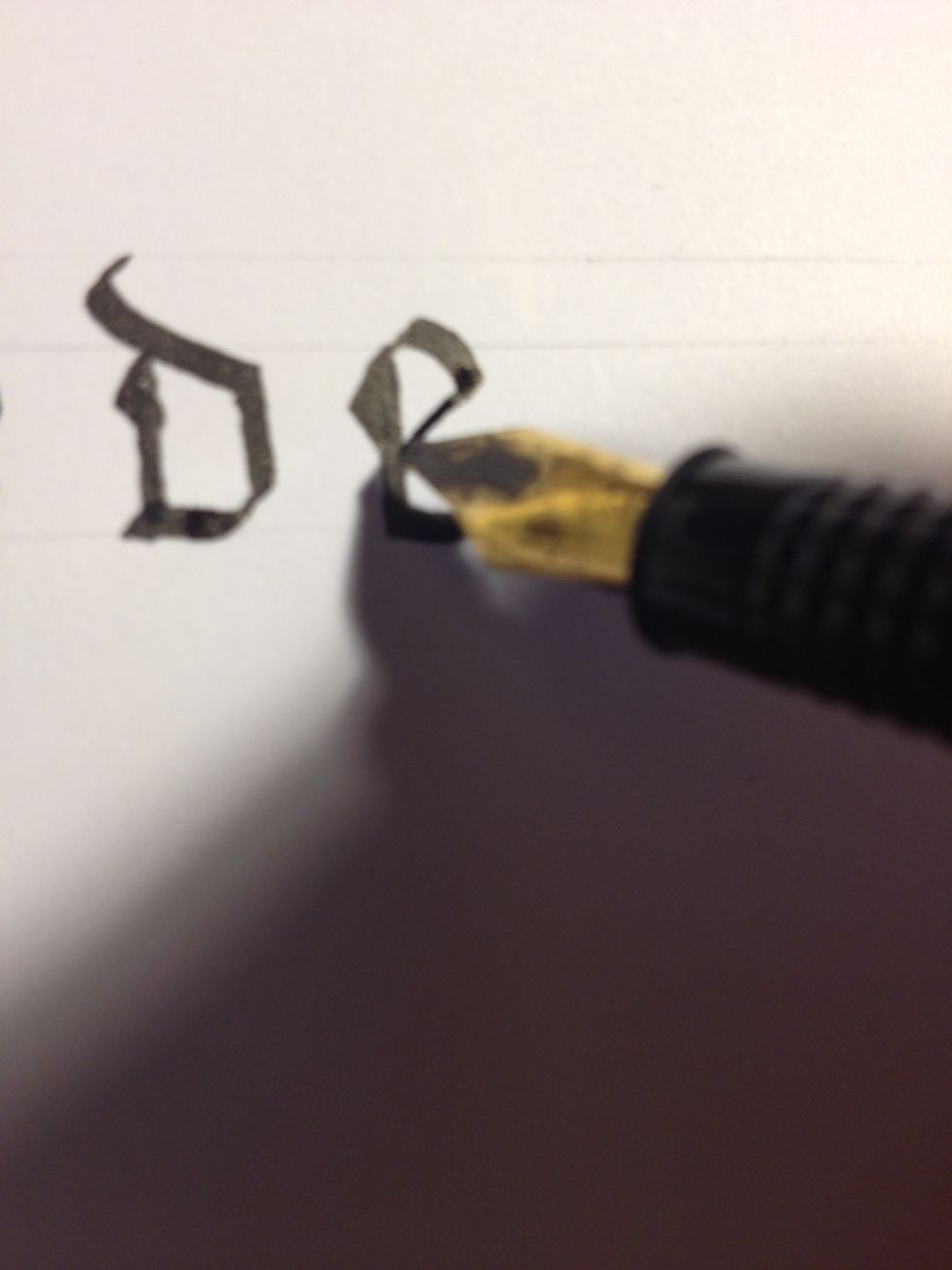
Start "c" with a basic trunk.
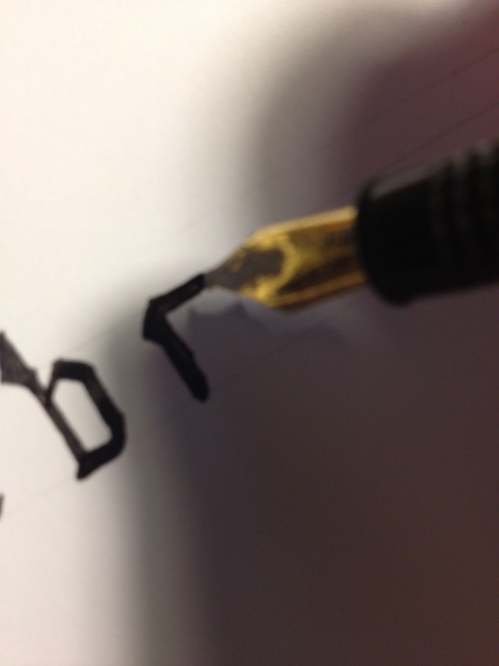
Add an embellishment to the top, then make a straight stroke across the top line.
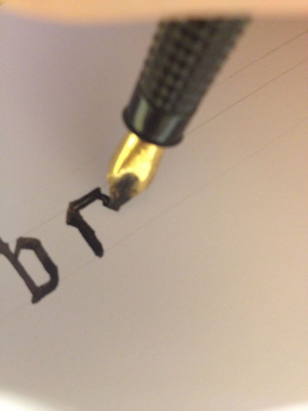
As an added flourish, you can add a small "tail" to the end of this stroke; rotate your nib to roughly 90 degrees and make a thin curve downward.
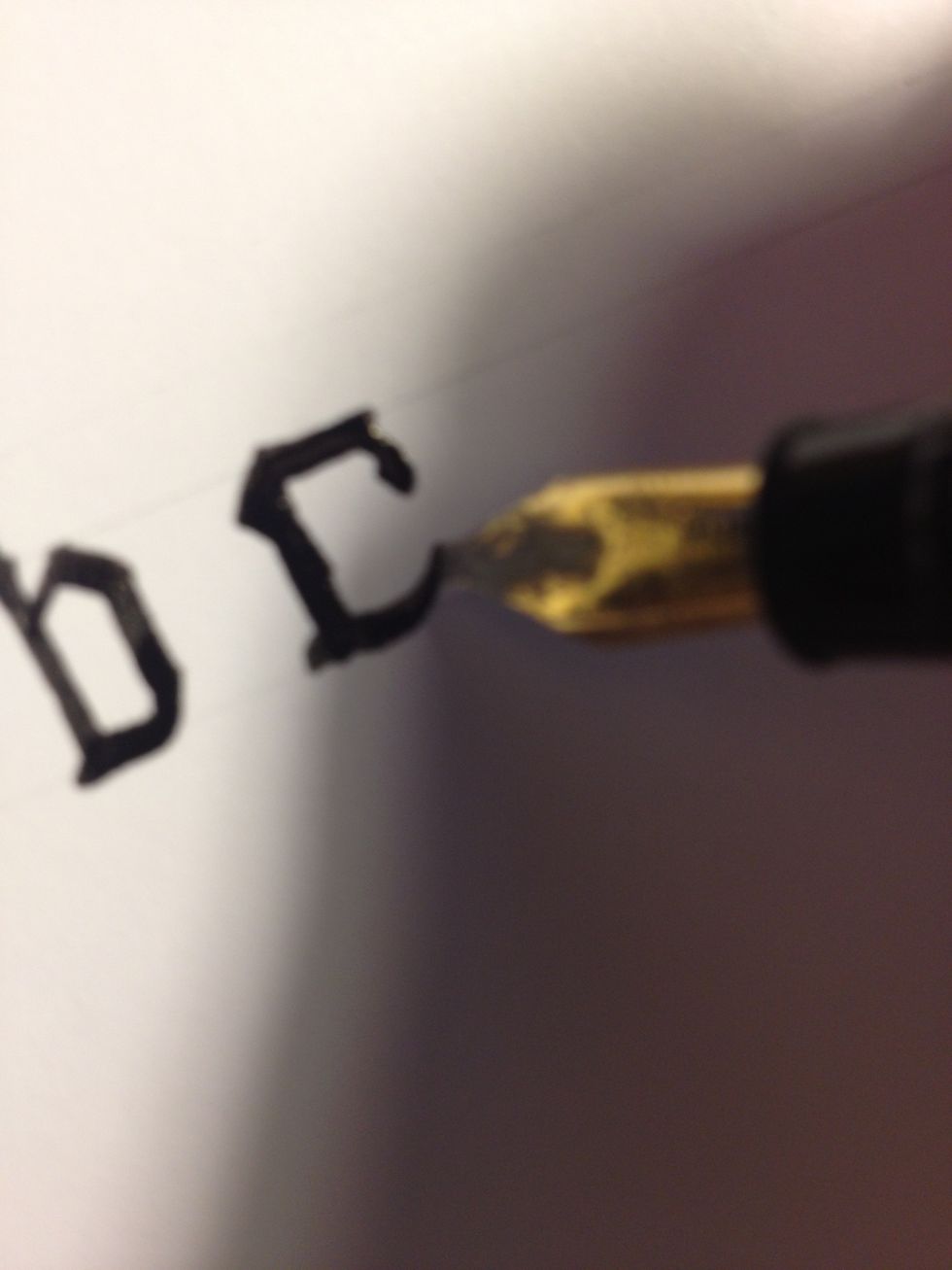
Make a line across the bottom line, terminating in a steep upward curve.
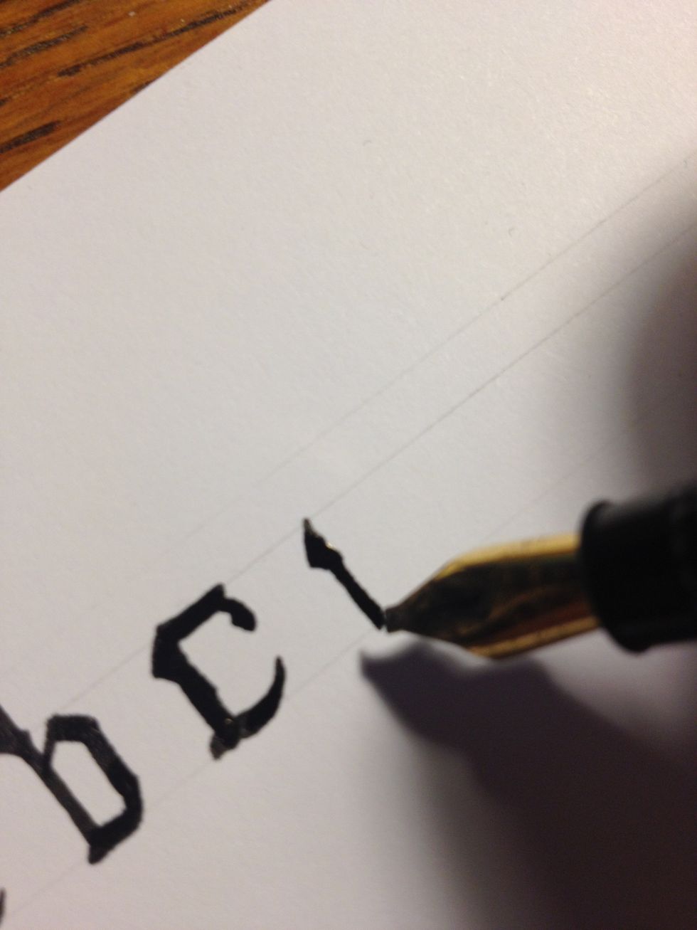
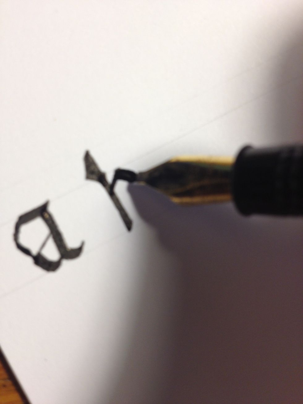
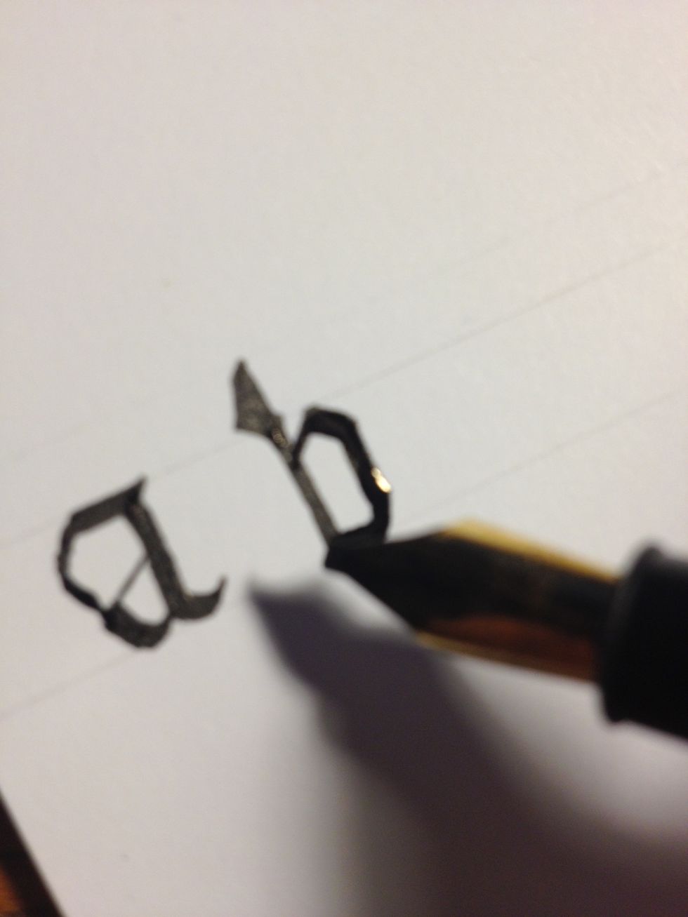
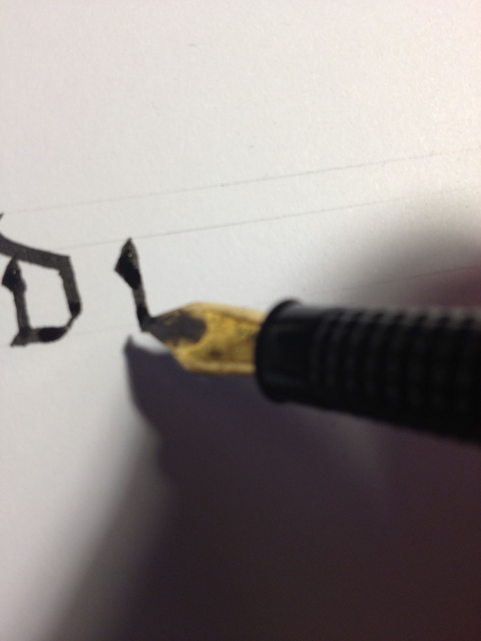
Letter "d" begins as a small trunk with an embellishment at the top. Take care: this is not the tall part of the letter, so don't make it any taller than your other Minuscules!
Make a line across the bottom line, curving upward slightly at the end.
You will notice I have drawn two top lines, about half the distance as between the top and bottom line. Start from the second top line and make a flourished downward diagonal ending as a trunk.
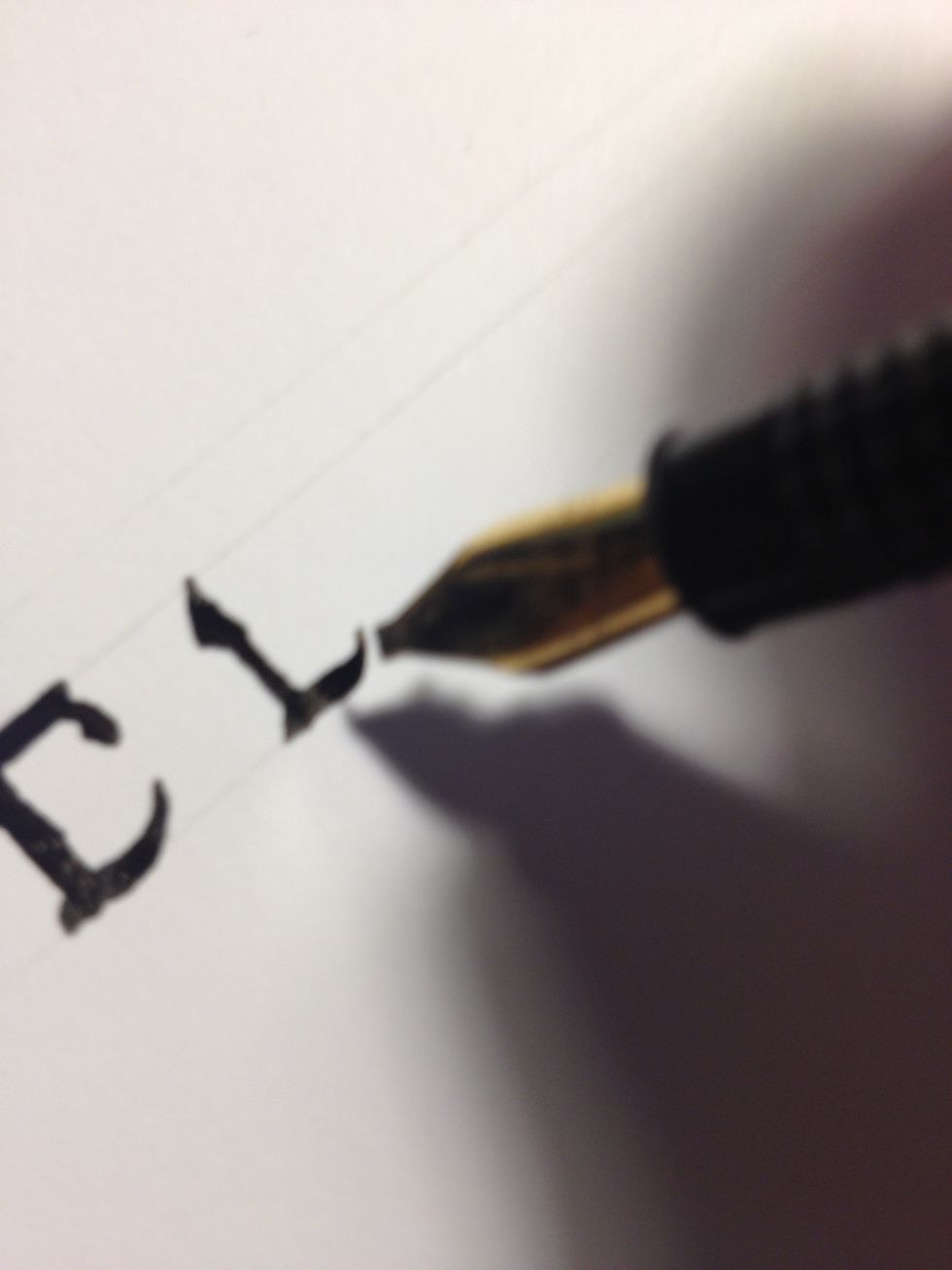
Letter "e" likewise begins as an embellished trunk.
Make a line across the bottom line, curving upwards steeply much like "c".
Make a very short thin upward diagonal from the top of the trunk, then a thick downward curve, and finally a thin downward diagonal terminating back at the trunk.
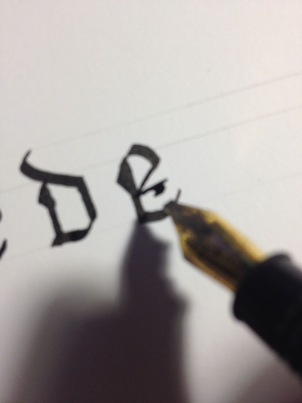
To further decorate the letter, rotate your nib so it is perfectly horizontal, then make a thin line out from the terminus of the previous stroke. Give this line a short, thick "tail".
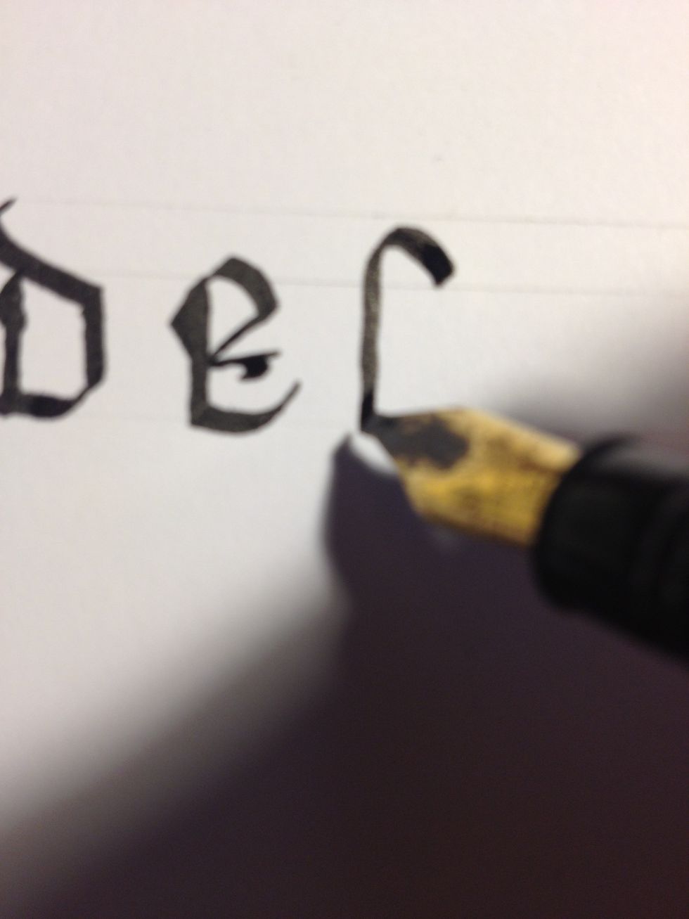
Letter "f" begins as a tall, plain trunk with a cane curve at the top. Note the curve's placement between the two top lines.
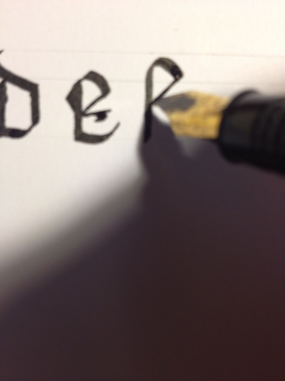
Make a thin downward diagonal from the end of the curve down to the trunk.
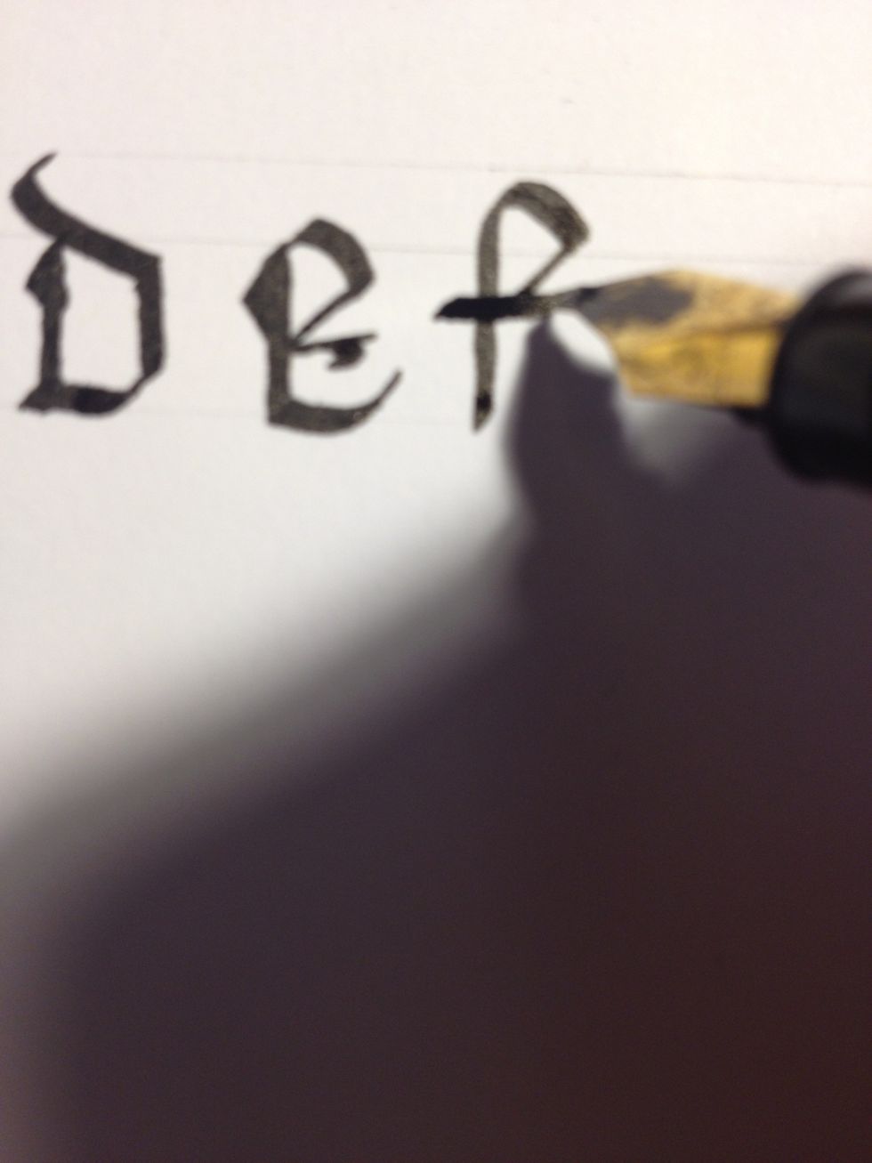
Cross your "f" at the terminus of the second stroke.
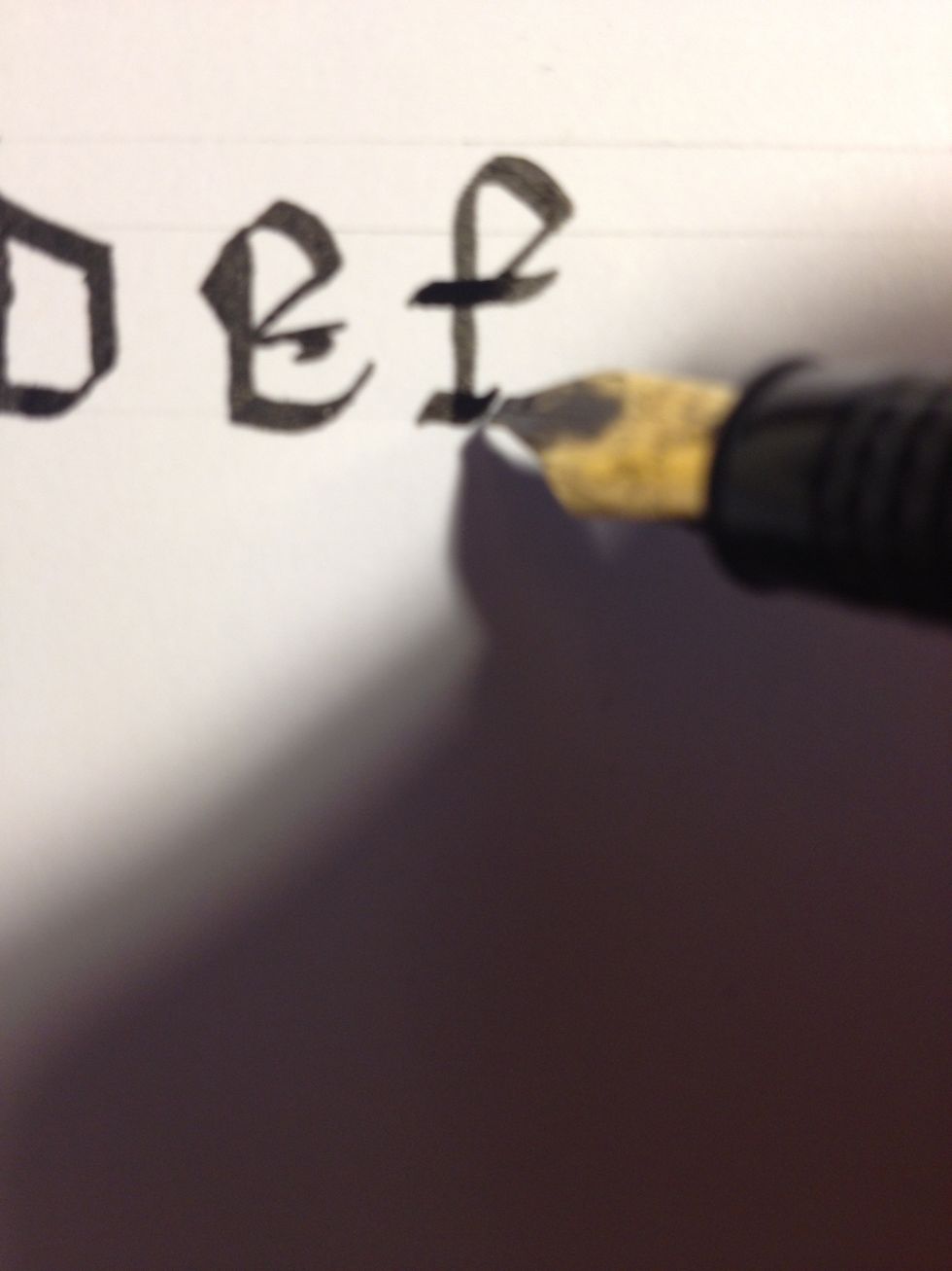
Add a "foot" to the letter by making a sharp upward stroke, shallow downward, and another sharp upward. This gives the base a distinctly "wavy" shape. Practice making the foot; you will use it often.
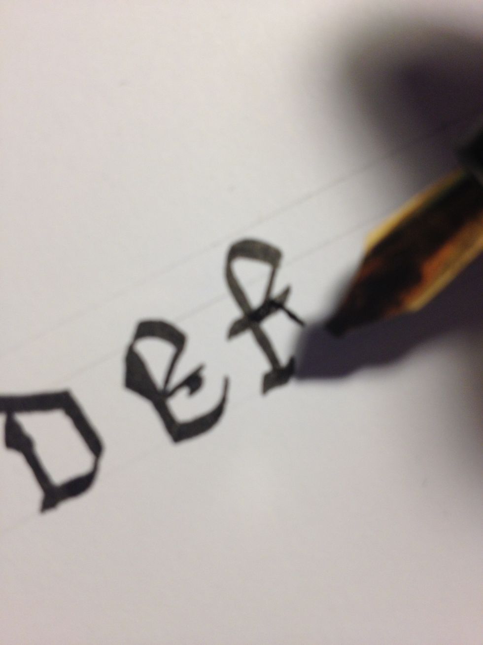
For added flair, add a thin "tail" to the crossbar.
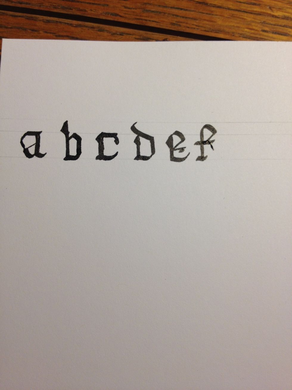
And so the Gothic alphabet begins!