STEPS
TOOLS
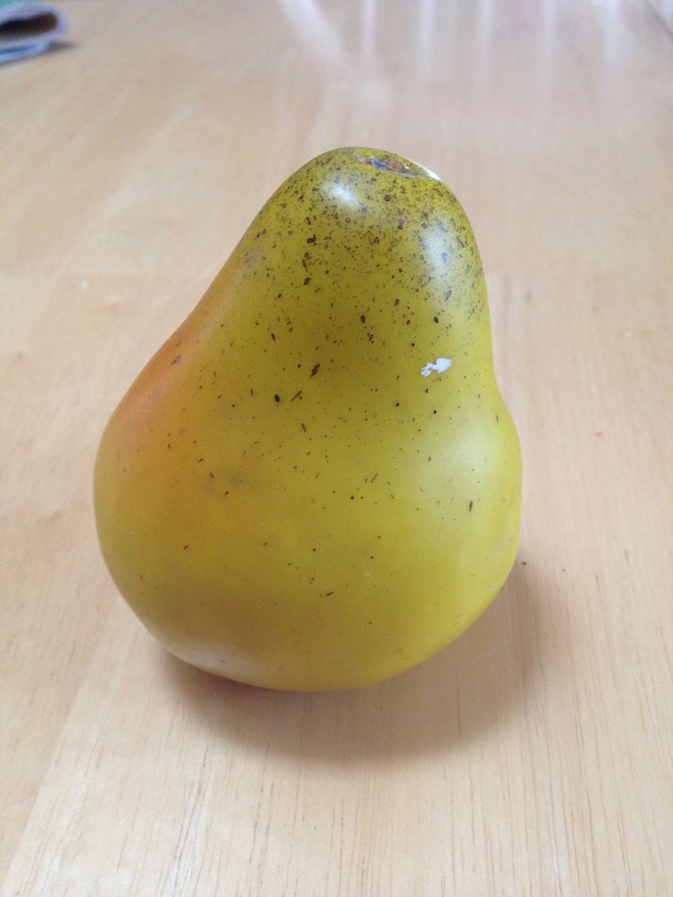
Carefully observe your object. Notice the top is smaller than the bottom, it leans to the right and it is a really bumpy circle. Also, think about the charcoal demo: its two stacked spheres.
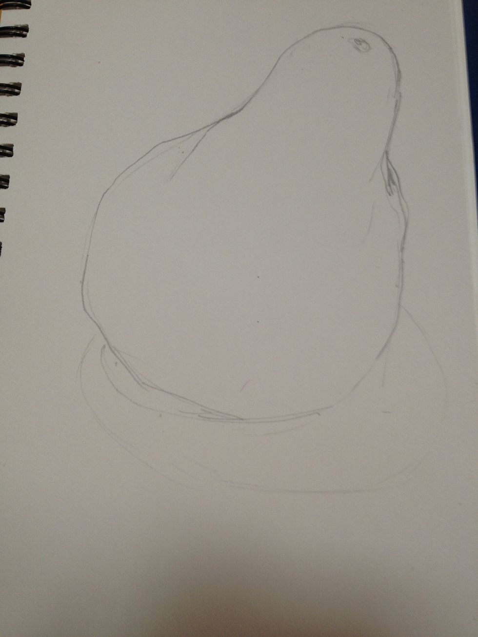
I made a light pencil drawing of the contour of my object making sure the top is smaller, it leans and has similar bumps to the original.
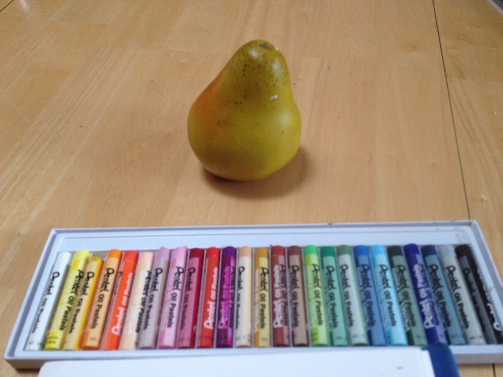
Our pastels are saturated colors that can be harsh when used straight from the box. I need to think about local color as well as analogous colors for shading and blues, reds or purples for shadows.
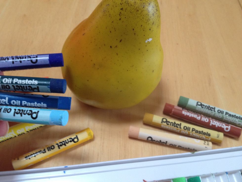
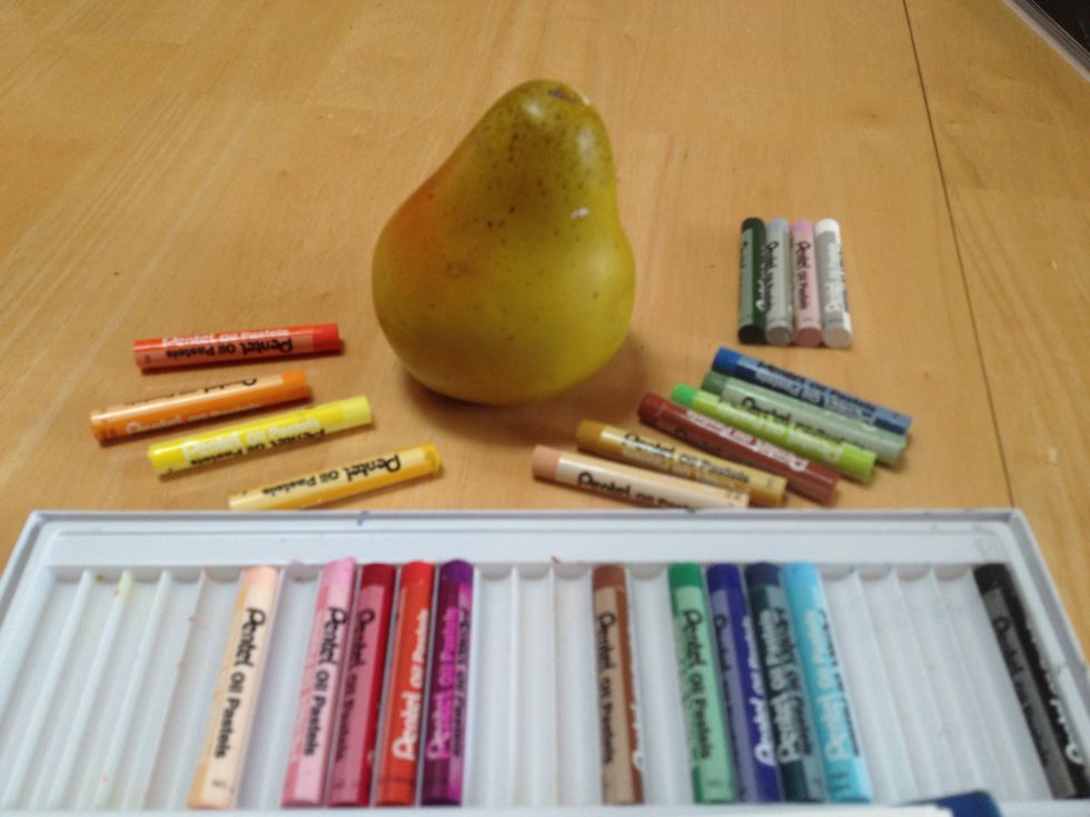
I think blue will work for the shadows, but which one? These are my choices but if I go too dark it won't look right. If I go too light it won't look dark enough. I decided on the second from bottom.
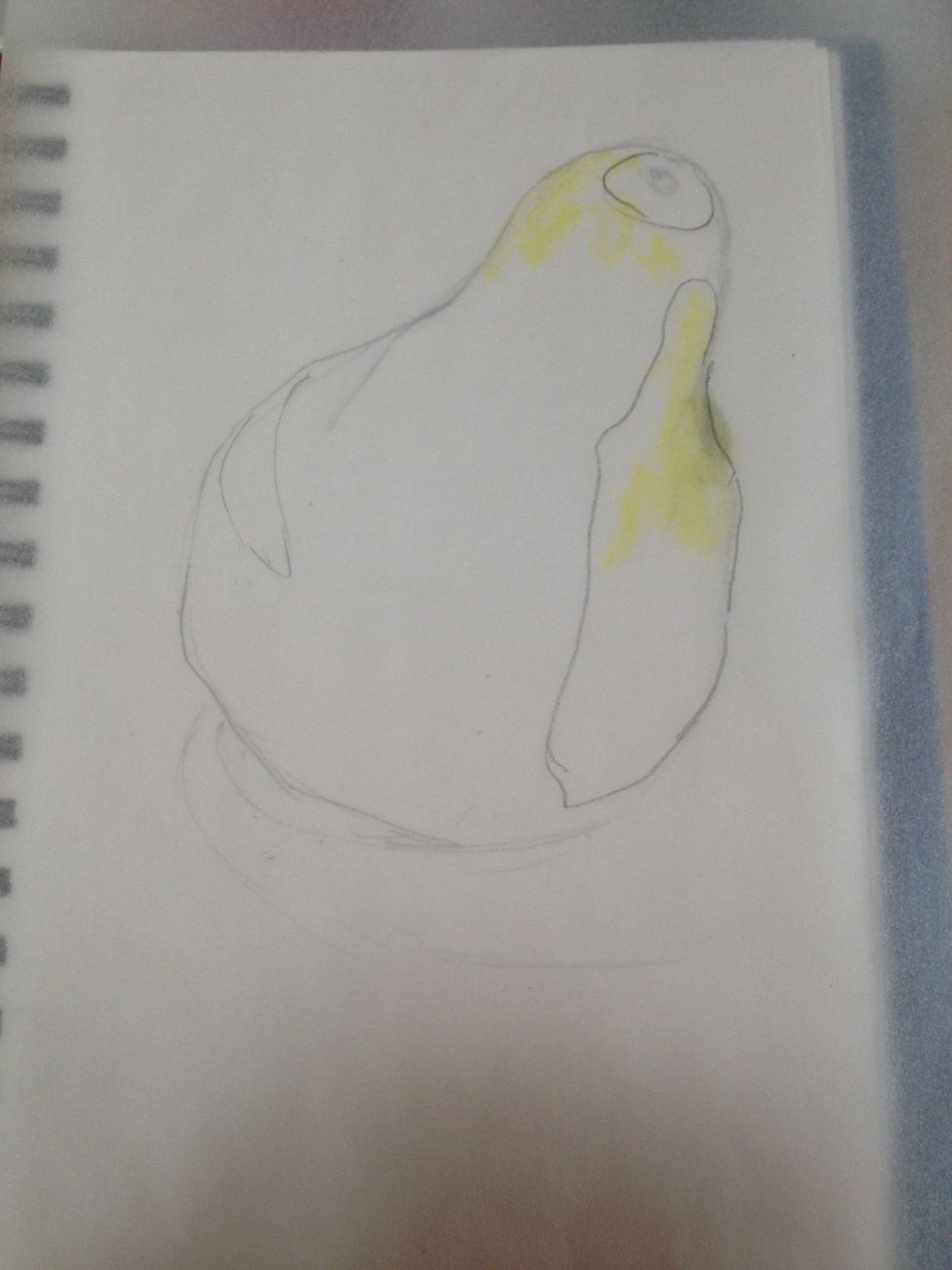
I am starting with the lightest color, a light yellow. While I will add a light layer over most, I concentrate the color in the outlined areas. Start light as you can easily fill the paper.
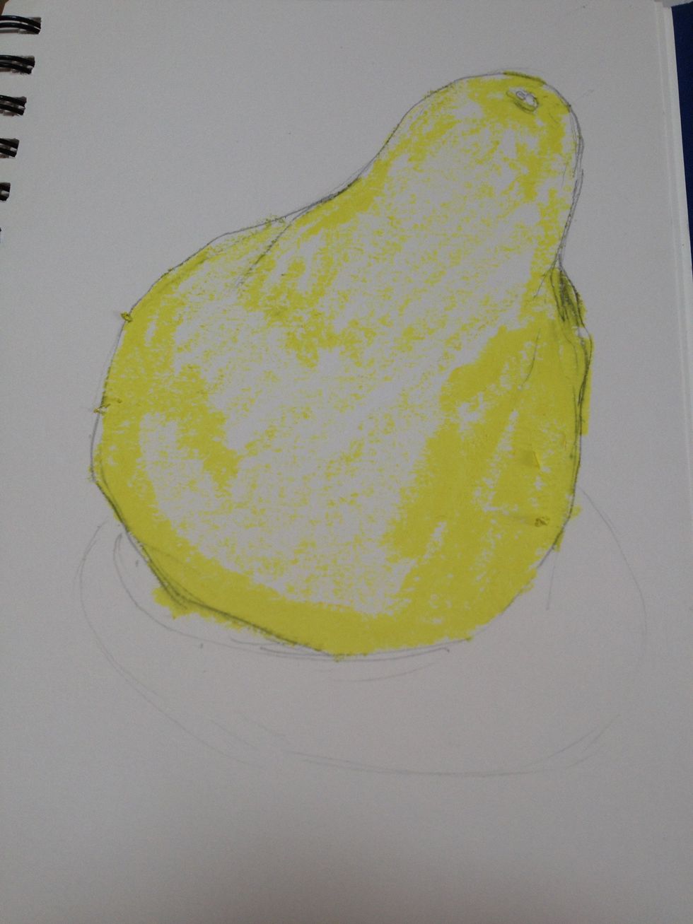
More yellow where there is a stronger yellow color to the pear and where there is more light including the reflected highlight on the left bottom from the table.
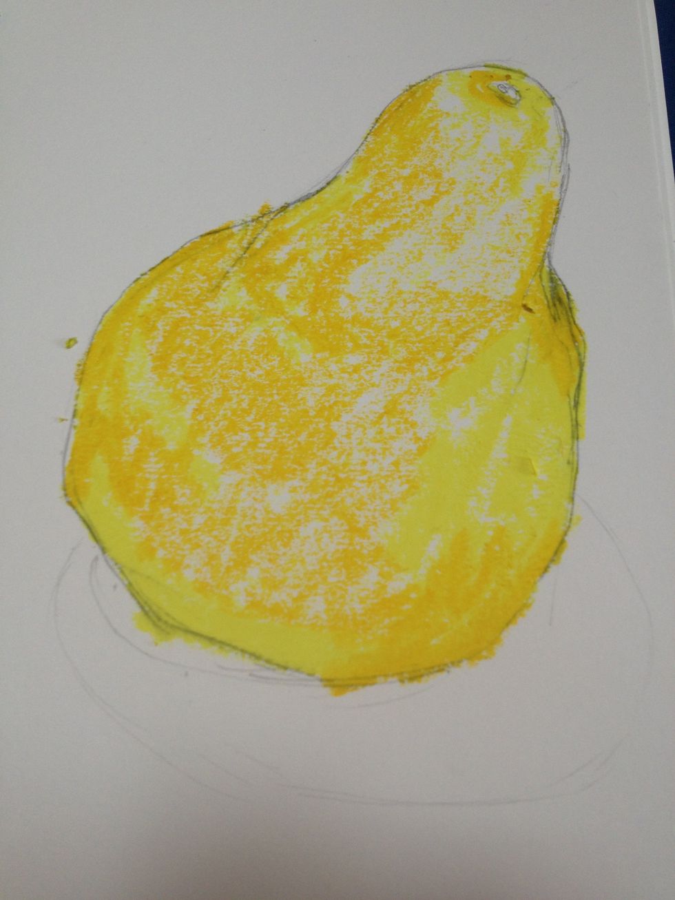
Using the gold color, I added pastel to start shading for form, just like with the charcoal. I also added more where I want the pear to have a more golden rather than yellow look.
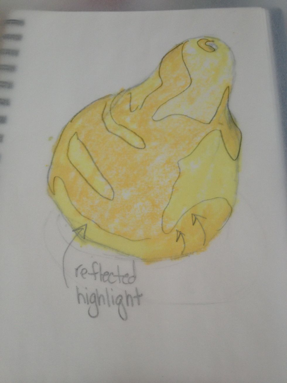
This shows where the gold was applied to show form and where the yellow was left to show highlights.
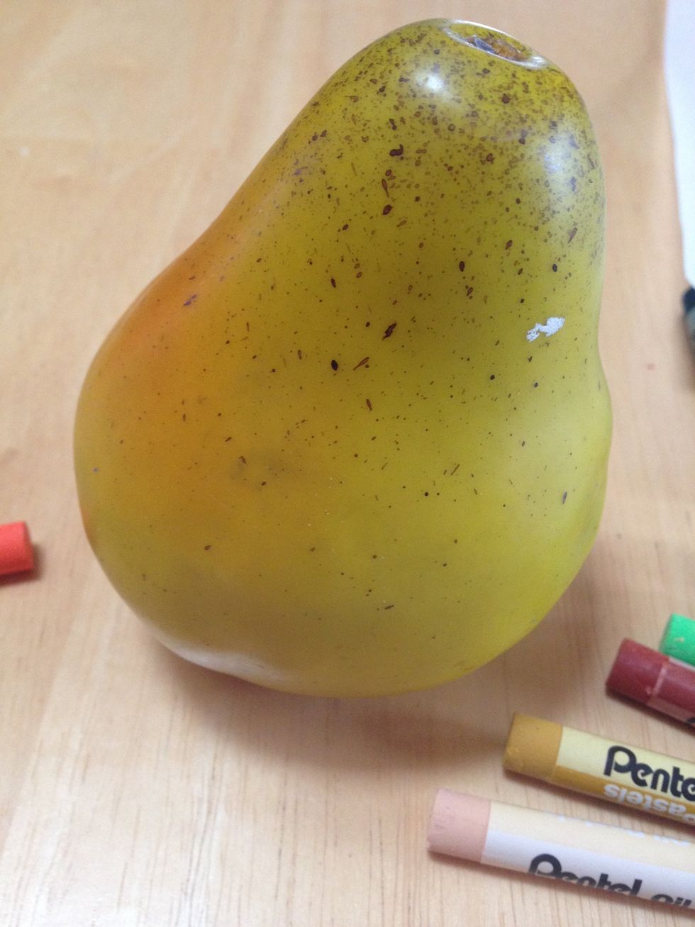
Remember the original? Keep referencing your subject to analyze the light and color. I think the orange area is next.
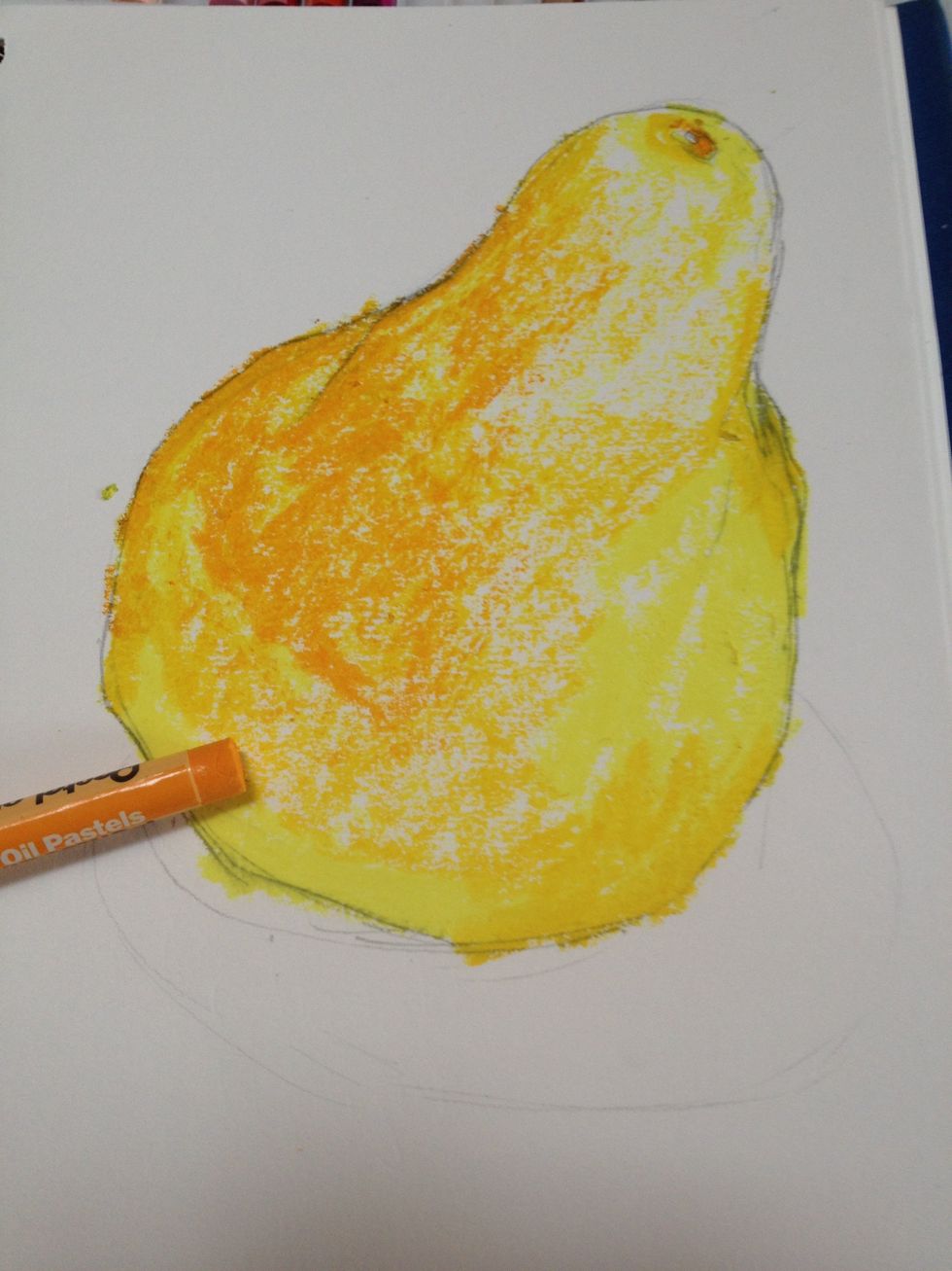
I started adding layers of orange keeping in mind I can always add more. Notice that your layers are starting to blend together. You can use this to your advantage when you want to modify colors.
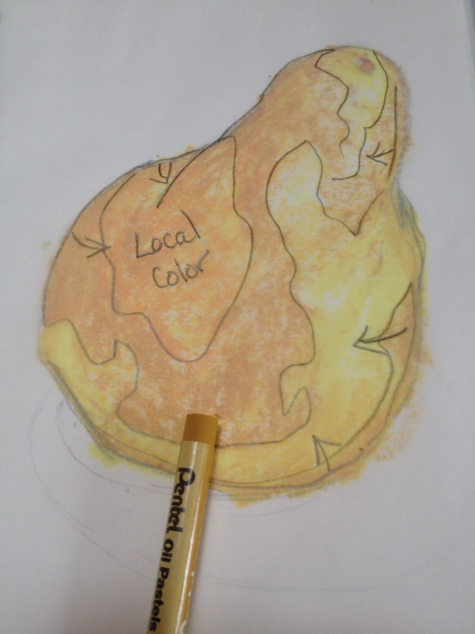
I am trying to fine tune the form and color here with the gold and the yellow. I am keeping in mind the local orange color as well as the highlight areas. I can add more drama to the shadows later.
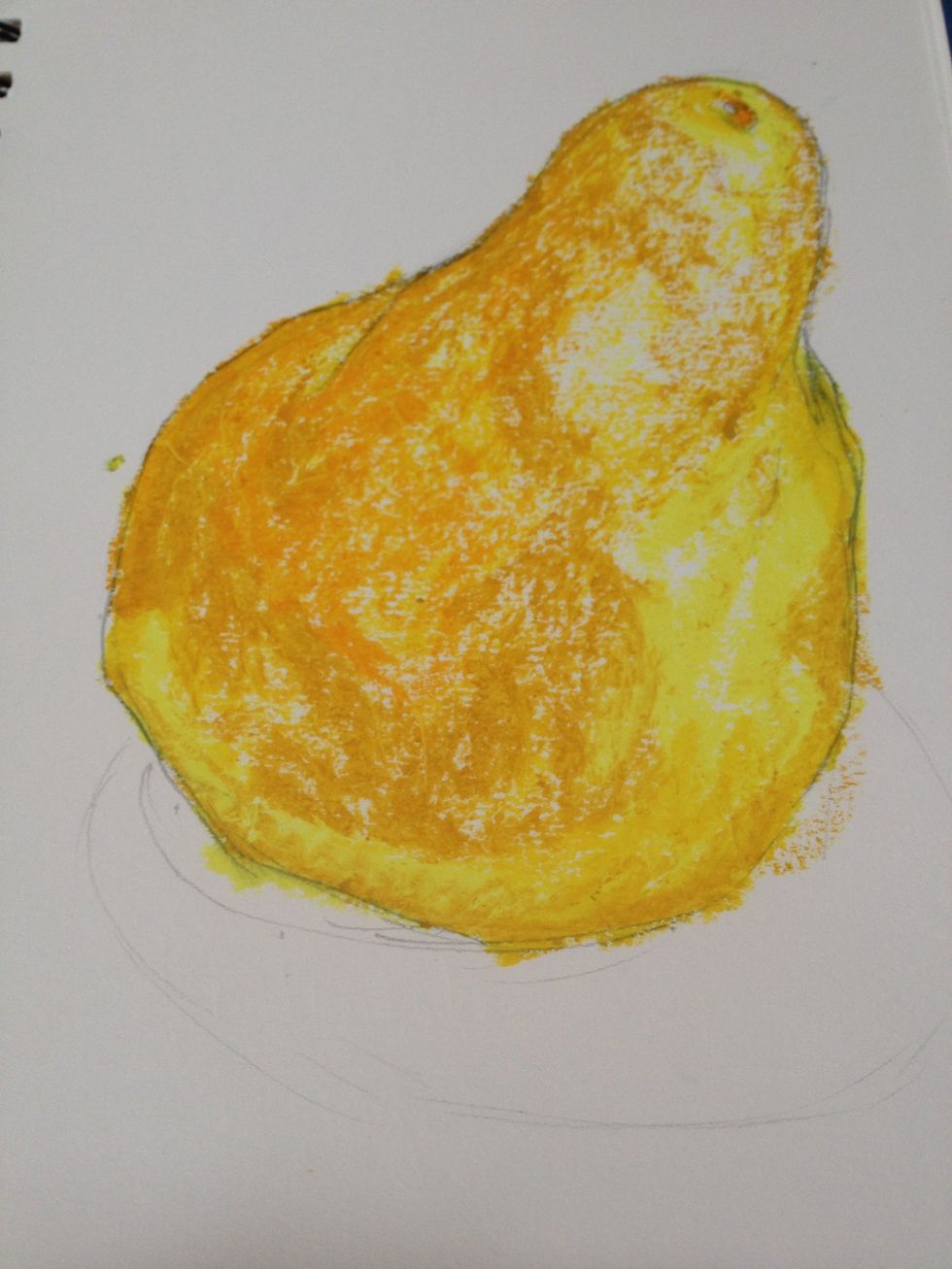
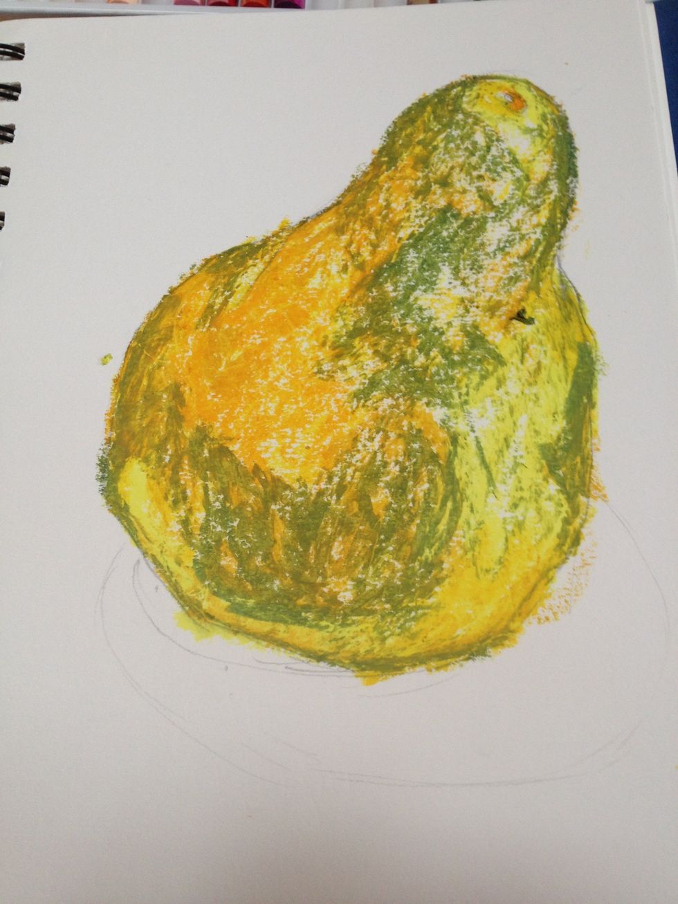
The pear is a weird yellow green so now that I have some of the form accounted for I am working the shadowed areas with a sage green. Notice how I am not going over the whole pear with the new colors?
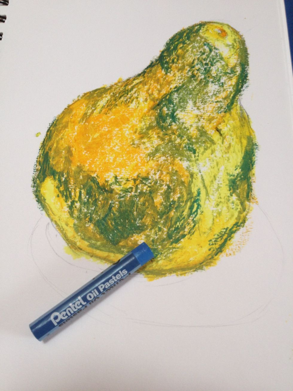
I need some punch to the shadows. My medium blue goes on just the darkest areas. The texture, needs to be softened. By using a lighter color over the top I can get my colors to blend.
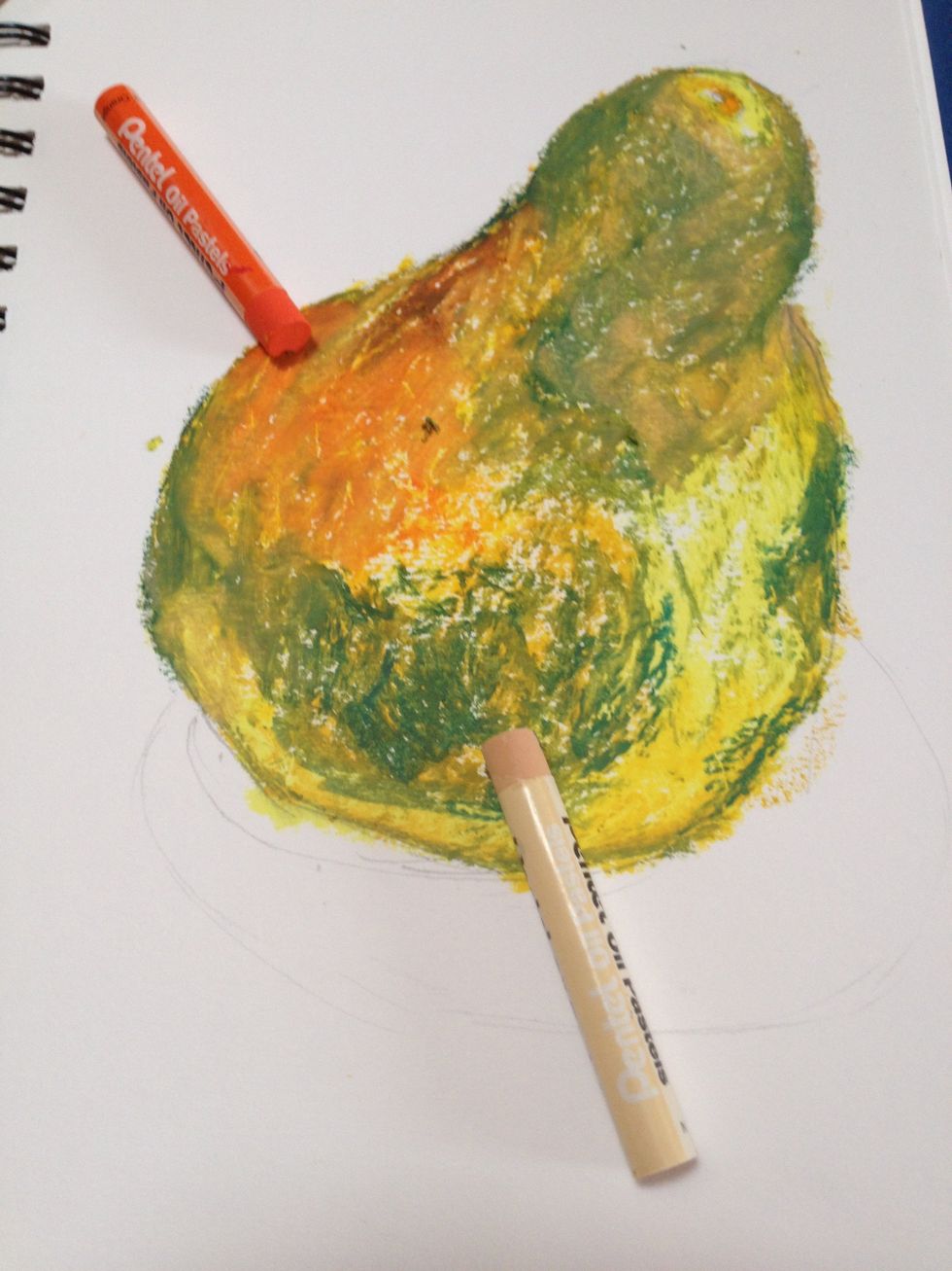
I want more pop of orange so I added a stronger color and a peach over the other areas to blend them. White is often too harsh so try a neutral first.
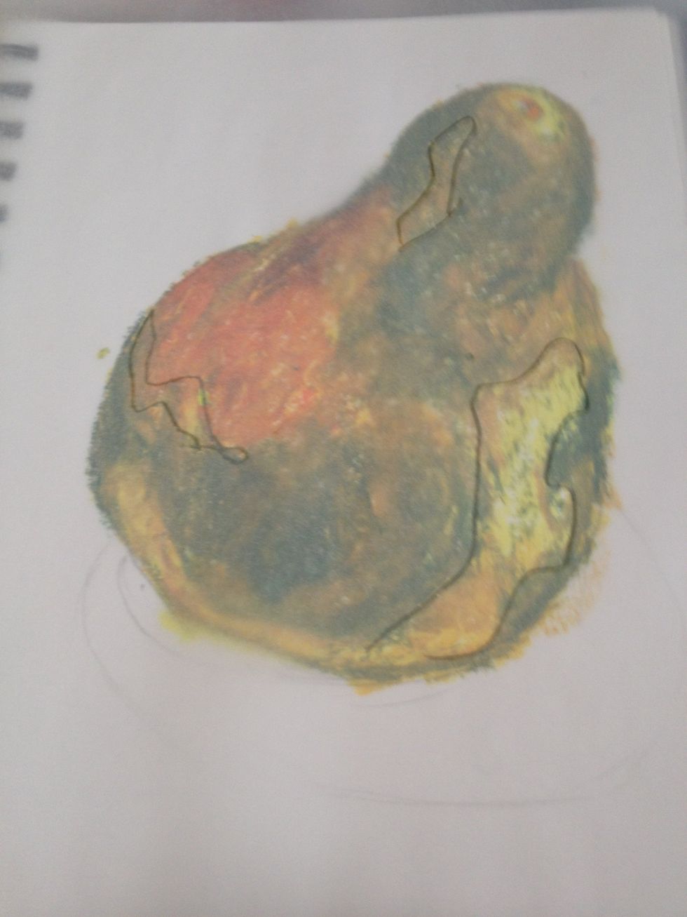
I added back some yellow to strengthen the highlights in the areas indicated. Keep in mind if I had gone too heavy with my pastels early I would have no room to adjust now. The paper would be full.
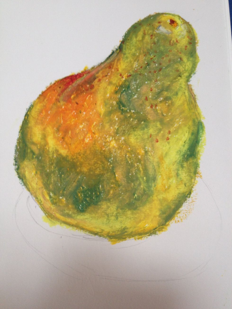
A pop of red on the back corner for drama and a sepia brown for the speckles. The peach blended while still kept the colors. Now the table and shadow.
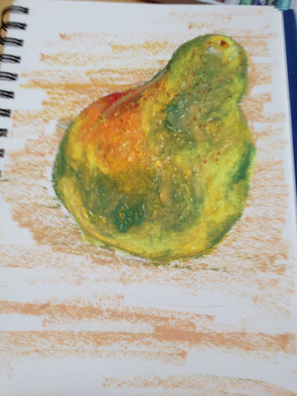
Peach for the table in a streaked mark, lighter at the top. My goal is not to cover the whole thing solid but rather to work with the white of the paper on a light object.
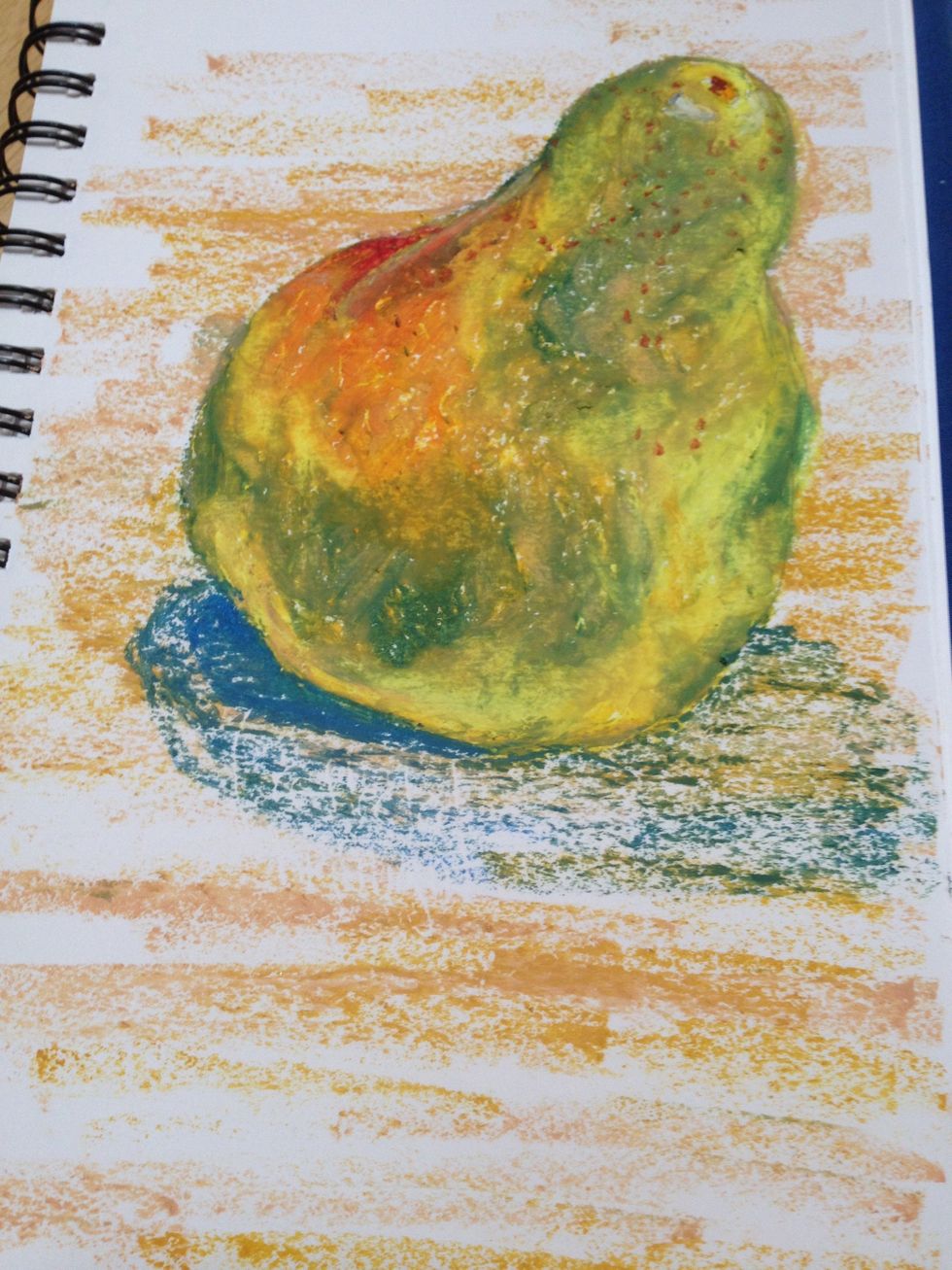
The same blue is used for the shadow. Shadows are darker right next to the object (umbra) and lighter around the outside (penumbra).
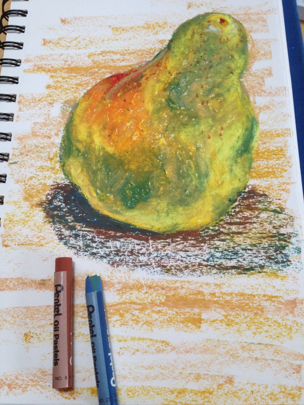
Blue and brown make a great dark if the blue isn't enough or looks too blue. Black is very harsh and will suck the life out of your drawings. Use it in case of emergency only!
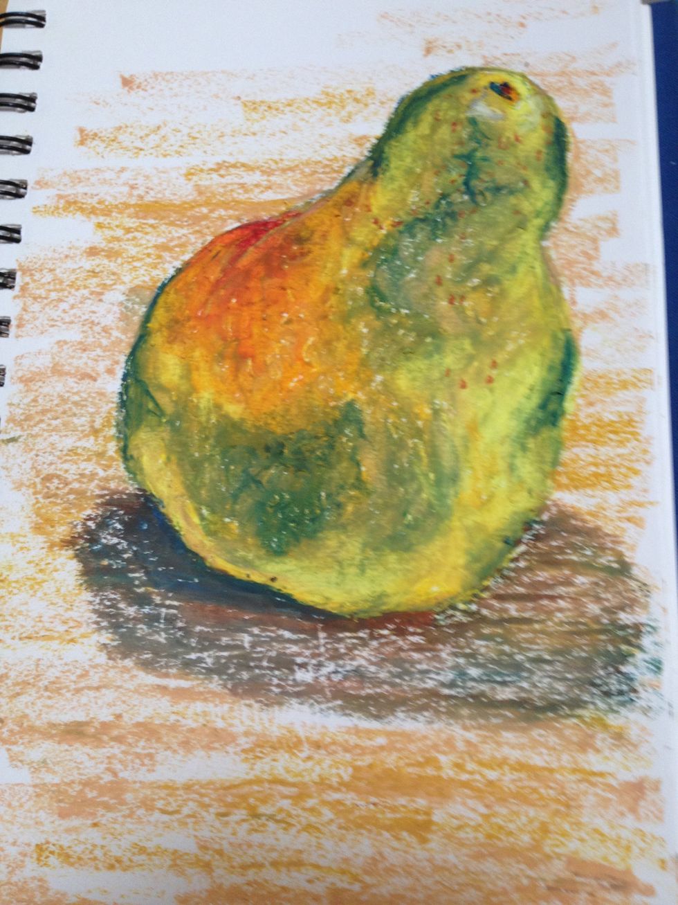
A little gold on the table makes that color more interesting and some peach on top of the shadow softens that as well. I also added a pop of dark blue in only the darkest shadows. Avoid outlining!
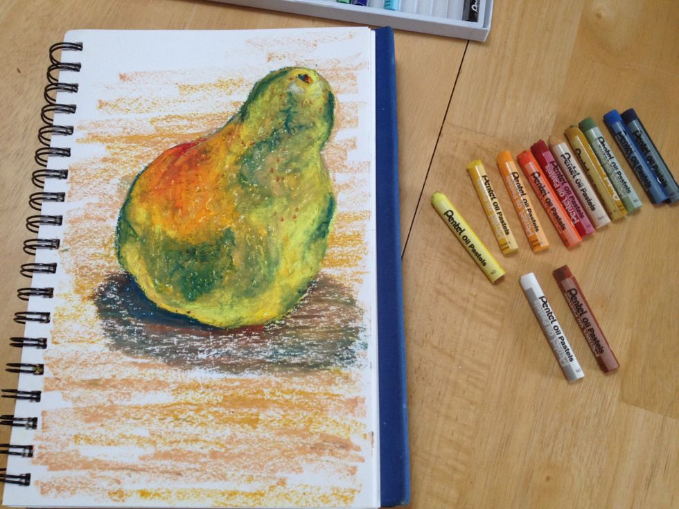
I pulled more colors than I used. The colors you use will give your drawing a different interpretation. Notice that when using pastels the final product has a much more saturated look.
- 1.0 drawing epncil
- 1.0 box oil pastels (I used Pentel)
The Conversation (0)
Sign Up