The Conversation (0)
Sign Up
In this guide I tried to explain the steps of creating your own fancy letters/initials. It's kind of hard to explain with pictures but pls try to follow. Practice is always key to everything you do.
Tools as usual

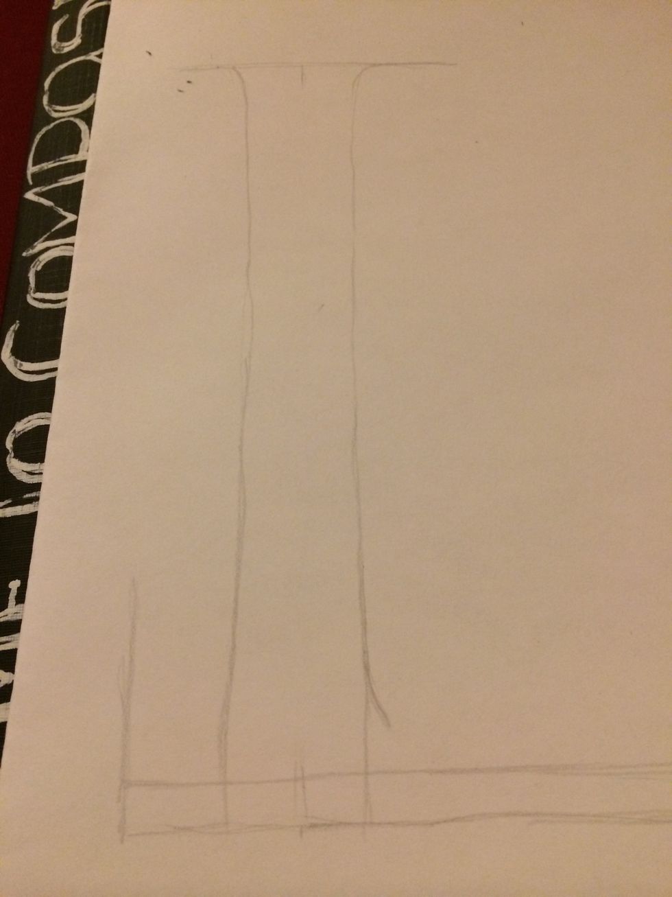
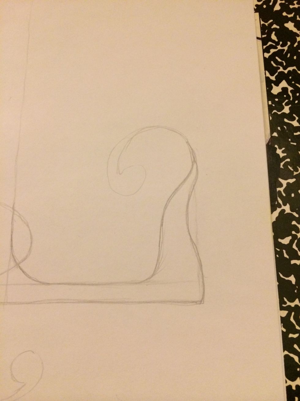
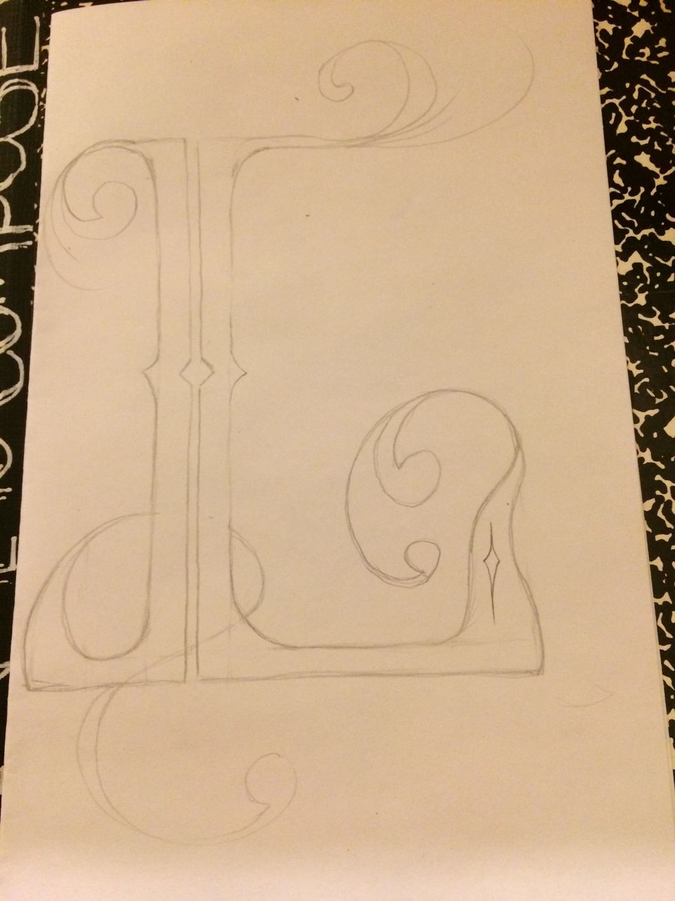
Start with a basic letter. In this case an L
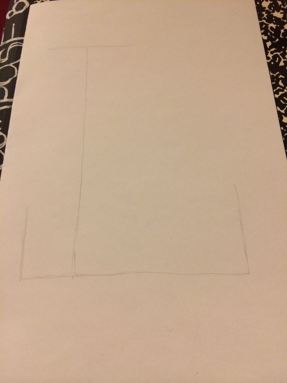
Give it the desired shape of how you want it to look. There's no limits in imagination
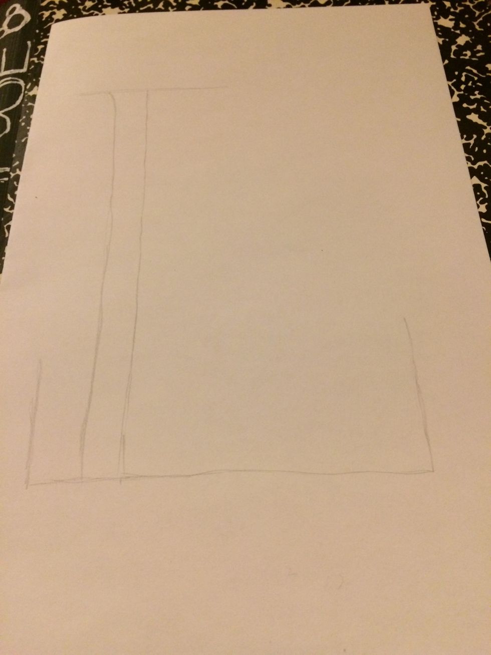
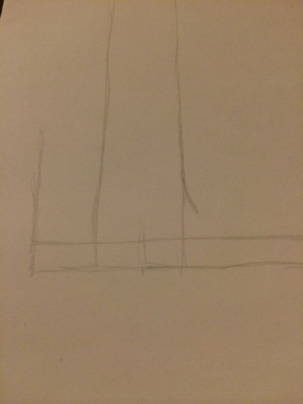
The basic step is to double up most of the lines as shown here. You decide on the thickness
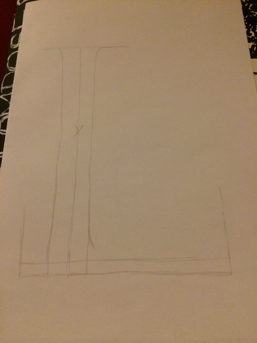
I added lines to both sides of the original to make it thicker. The one marked with "x" will be erased. Don't need to mark it as long as you know which lines need to be erased.
Original line erased. Only one line was added to the bottom line as you can see here.
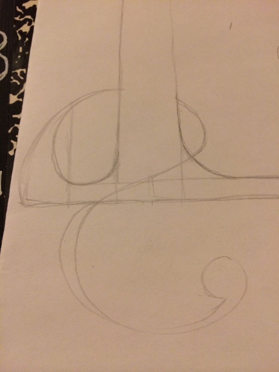
Start by curving the corners of your letters to change the look

You can leave some lines straight.....
Or curve them
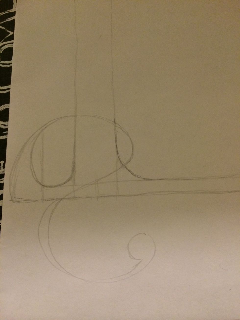
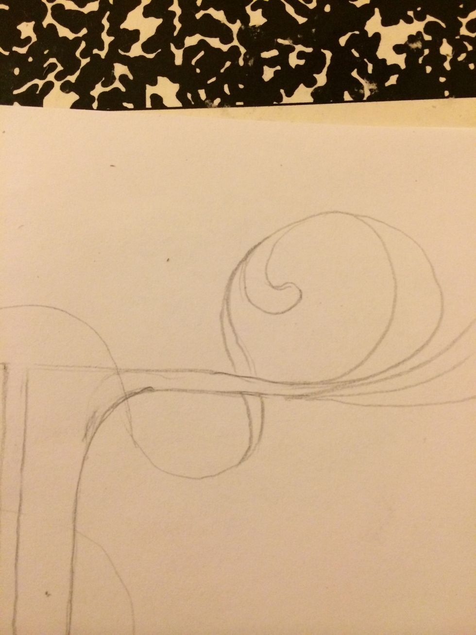
Add curves/curls to the ends of your letter. As to the shape and length that's up to you
Doubled the lines and added curves/curls

Added more curves/curls. Now it's taking shape
Decide if you want the curves/curls to show on top or below the letter and erase as needed
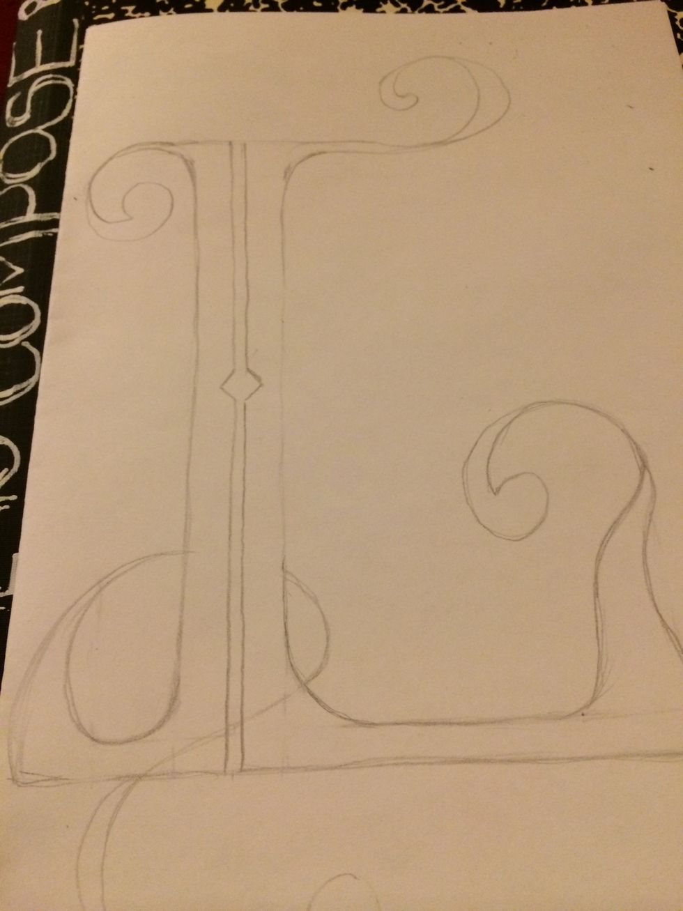
Here I added extra design by splitting the longer part of the L. Remember, no limits to creativity
Extra design
Looking nice huh?
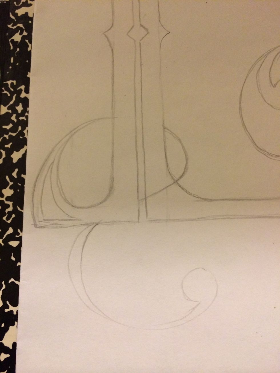
Curves/curls going over and under
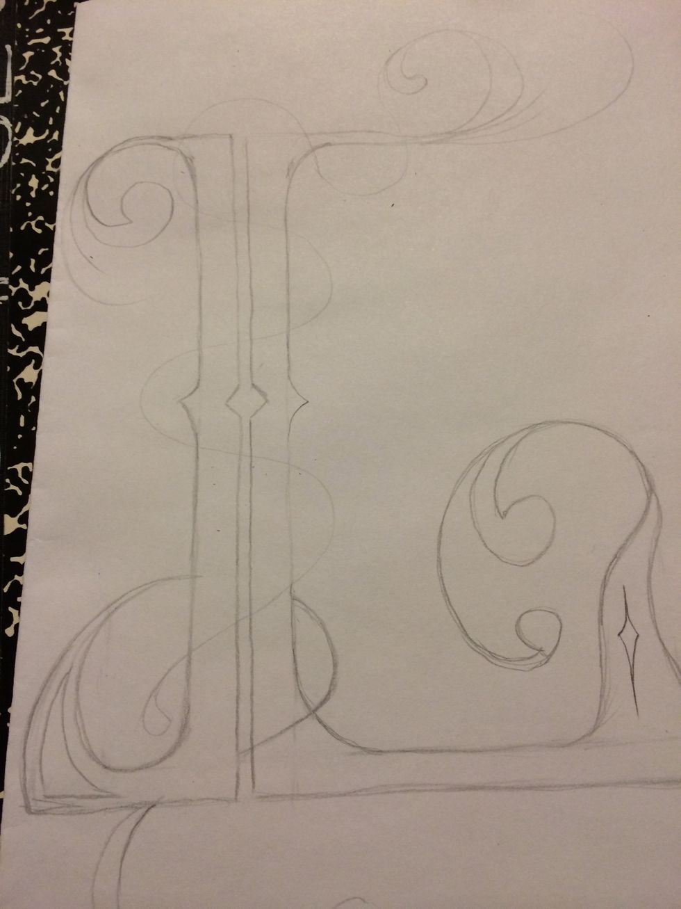
Here I'm wrapping a curved line down the L. Always draw light so it's easy to erase if needed
More design added
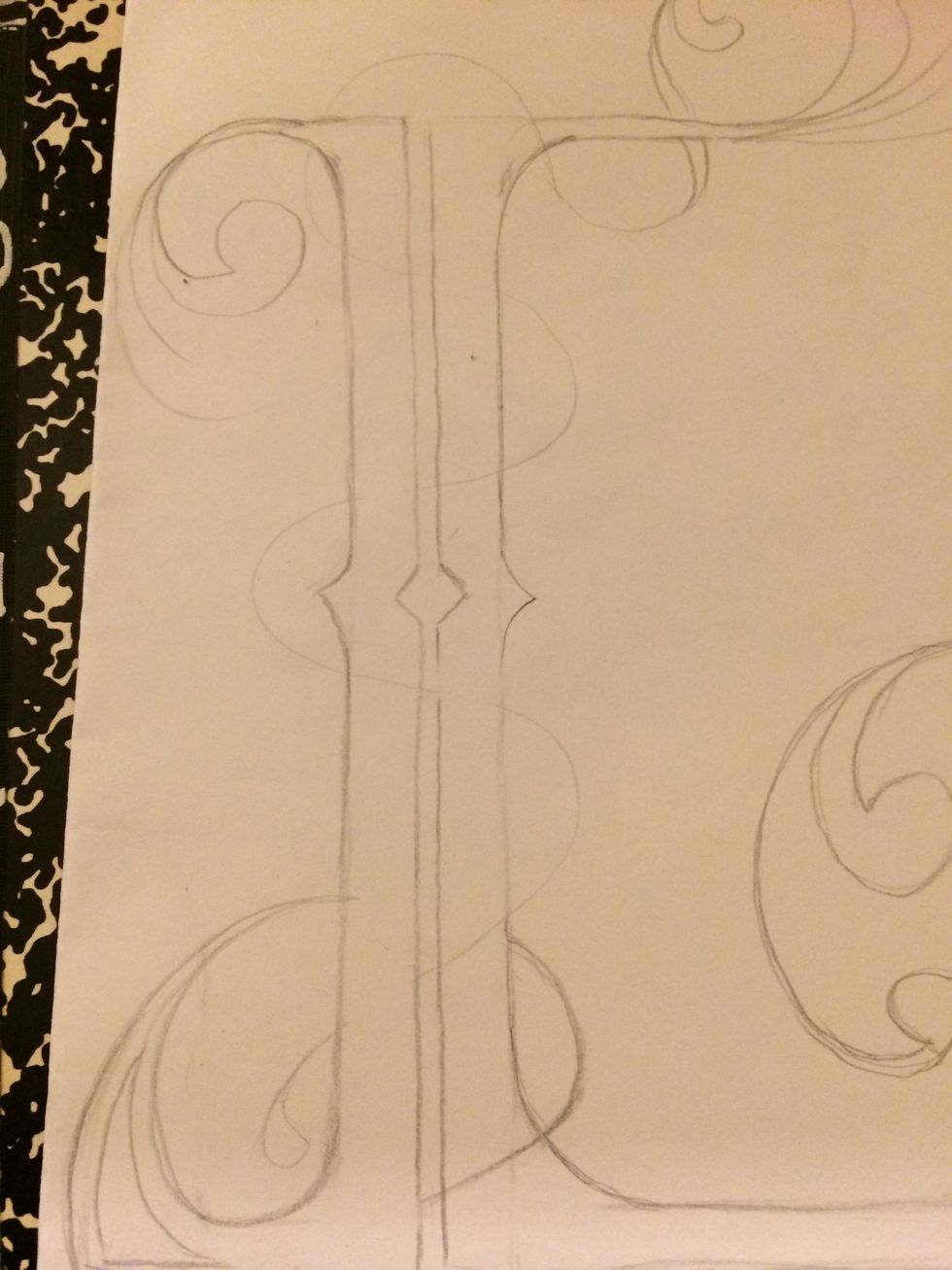
Curved line will go over and under

Think this should do it but lots more can be added 👍

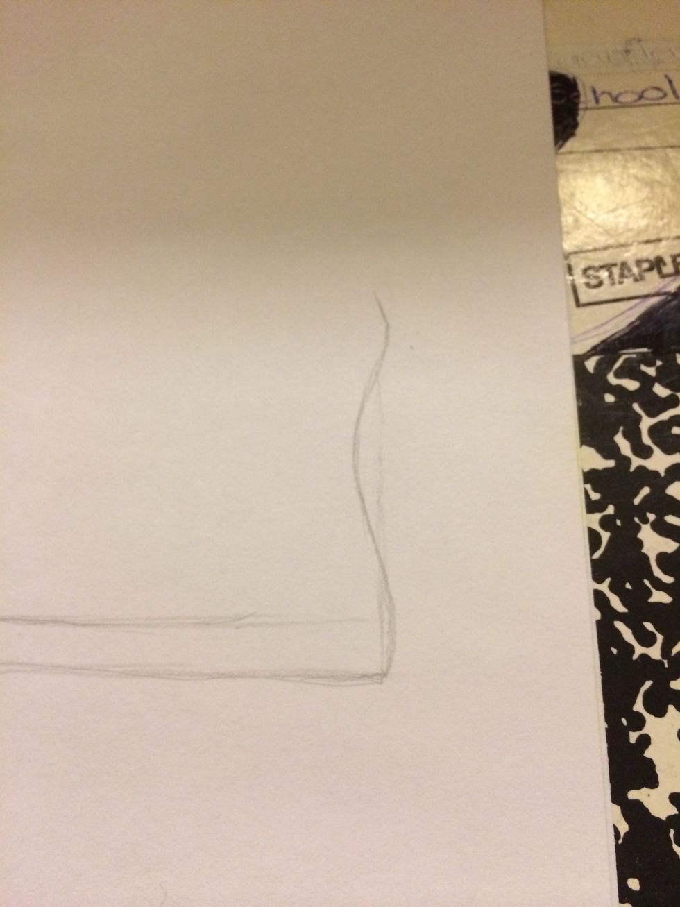
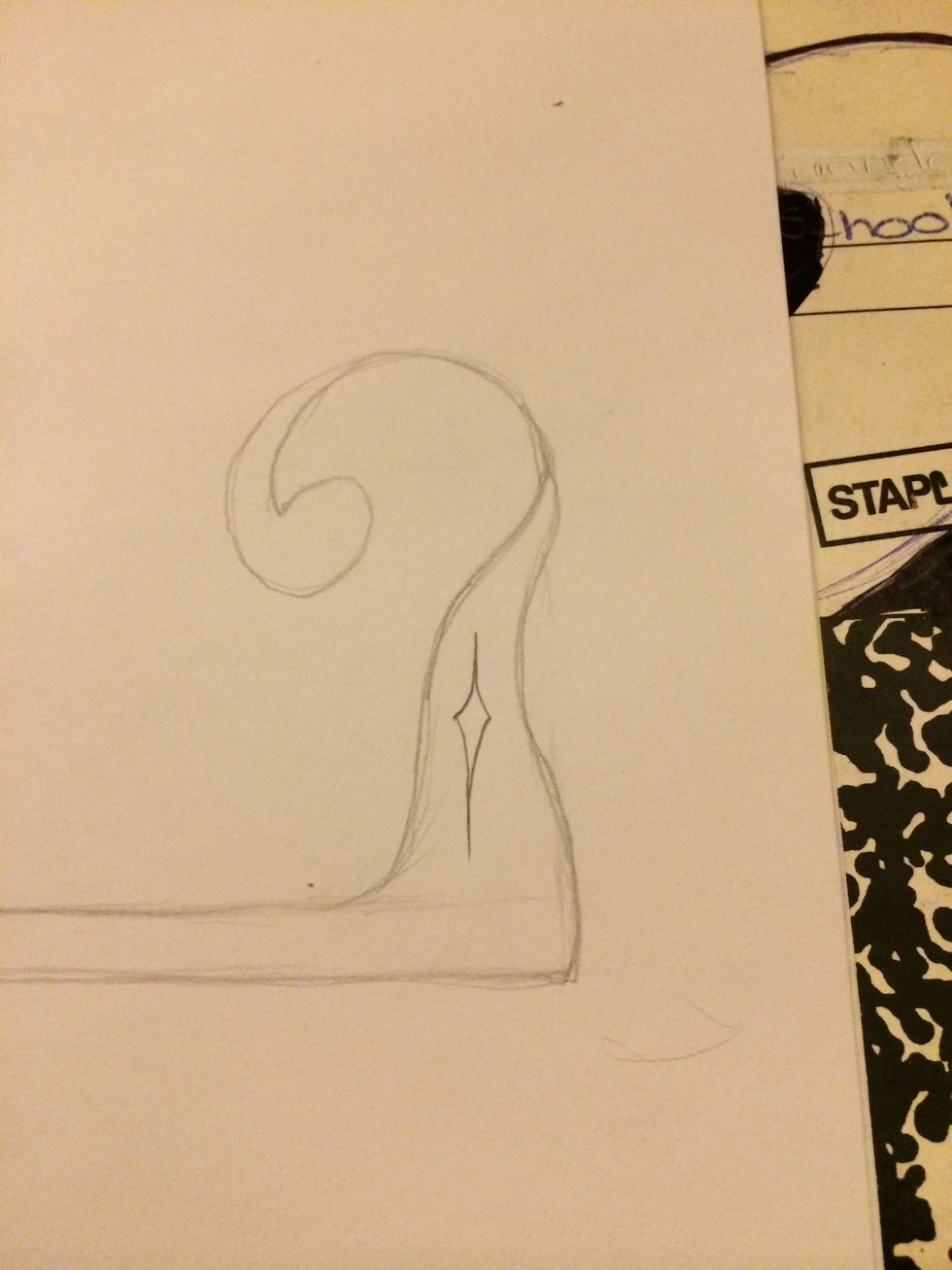
Give it a frame.

Doesn't matter if letter goes out the frame. Not everything needs to be centered
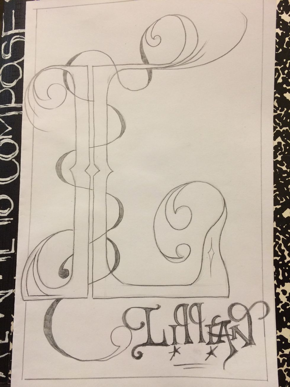
Done. You decide if to color, trace or leave as is. The choice is yours. Thank you for watching. A couple of videos to follow